Forest - Collectible Trading Card Game Branding, Packaging
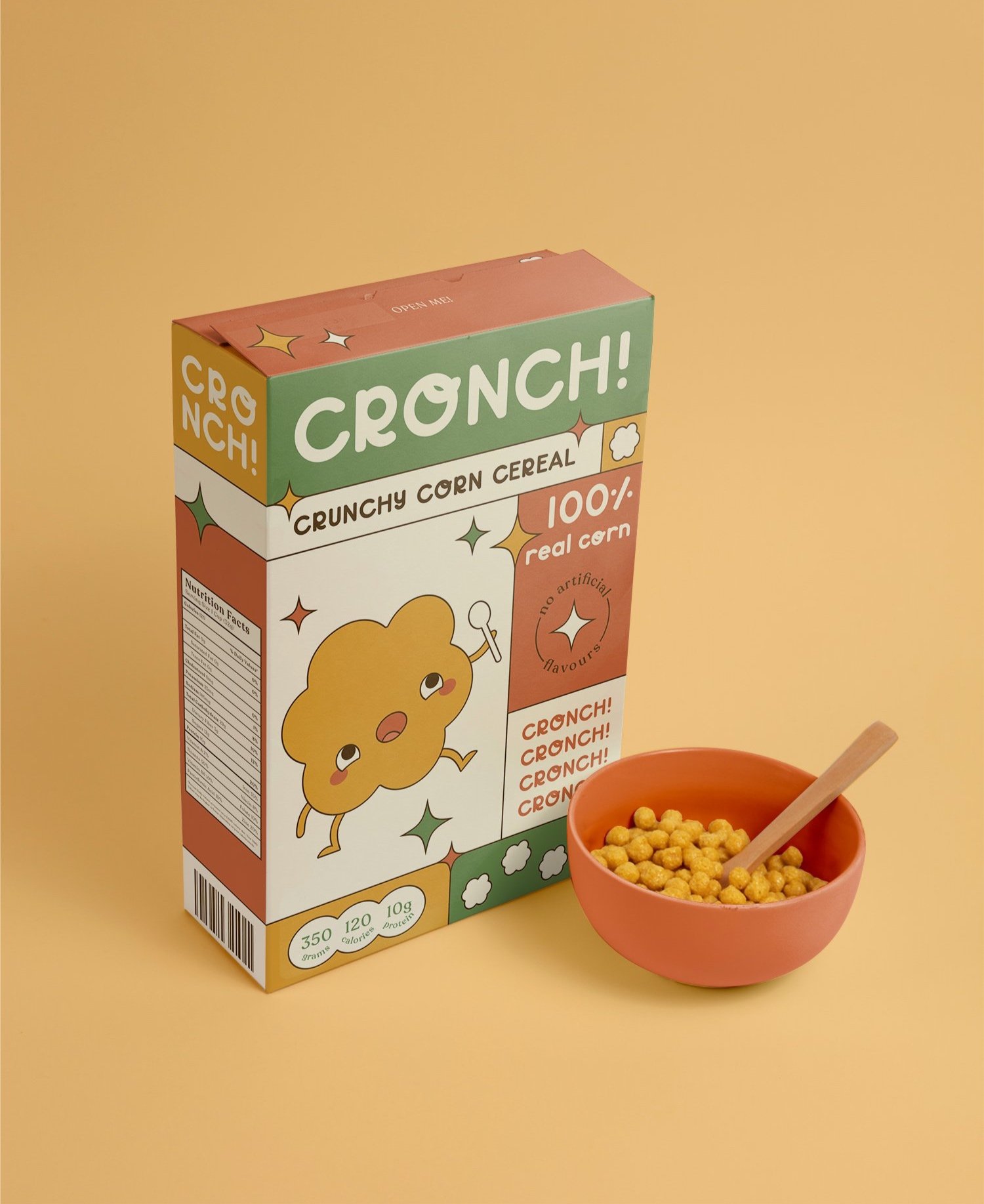
CRONCH! Cereal Branding, Packaging & Custom Made Font

Terranota - Stationery Branding, Packaging, Promo Materials

Lull - Imaginary 40 Page Magazine

Gogo Pop - Packaging Design

Little Tikes Re-brand, Promo Materials

Peter Pan Book Cover, Movie Poster, Promo Materials

Farmhouse Tavern - Recreated Menu

IKEA Sustainability Marketing & Design
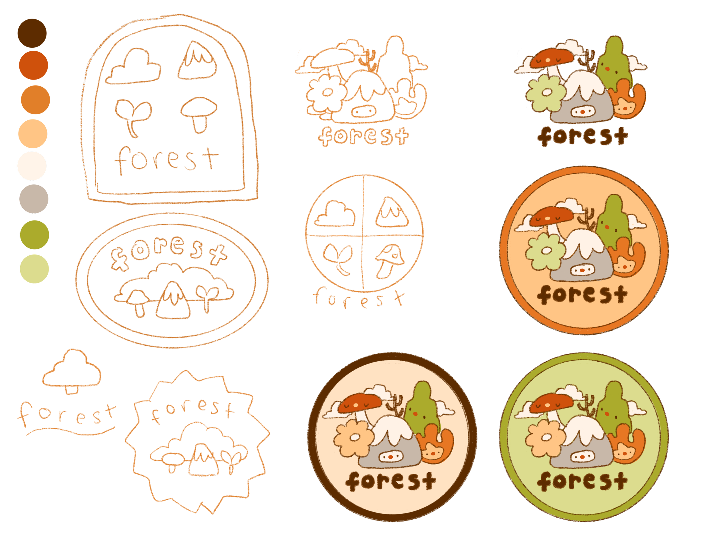
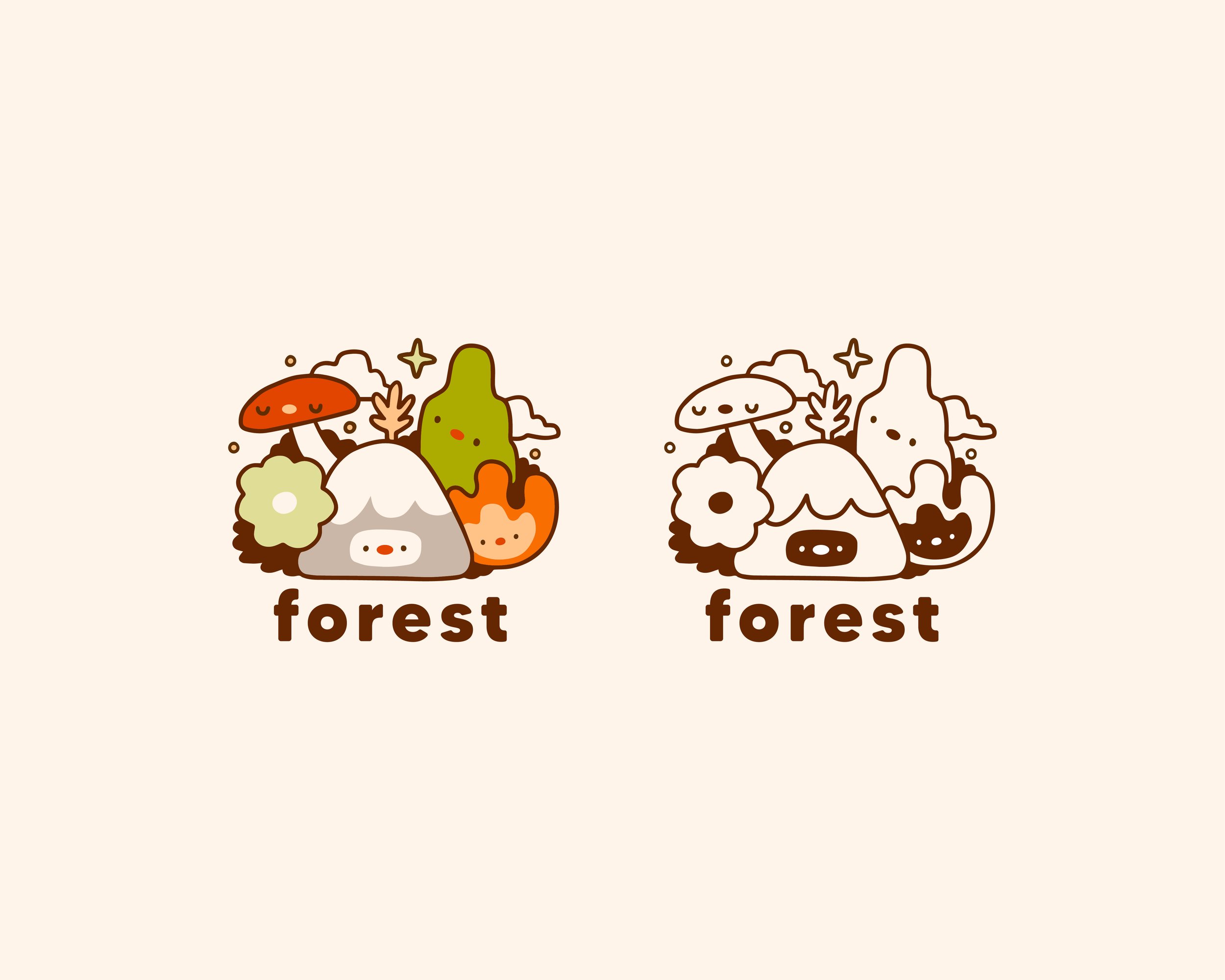
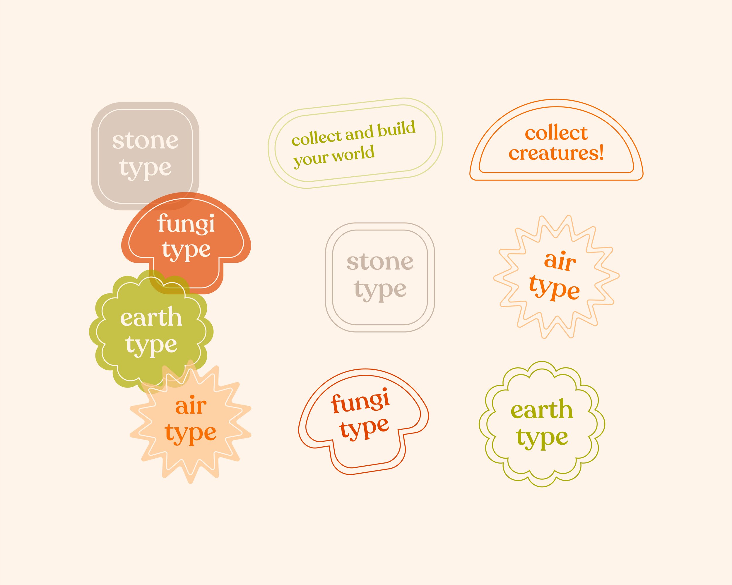
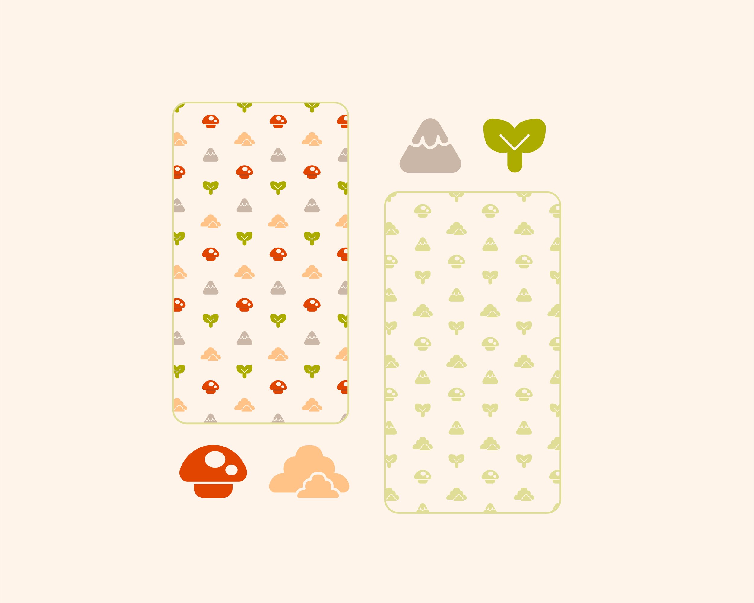
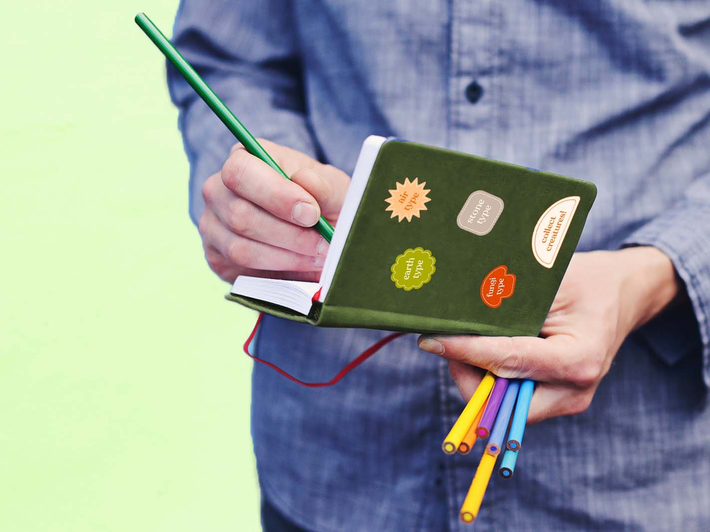
Forest Collectible Card Game
Forest is a collectible card game that is focused on illustration and design, as well as building an imaginary whimsical, nature filled world.
Forest values creativity, imagination, caring for our earth, and living out your inner child through adorable, quirky creatures.
The game is fully functioning as a playable card game, but is also just used for collecting and trading amongst friends!
The brand slogan is:
“Collect and build your world!”


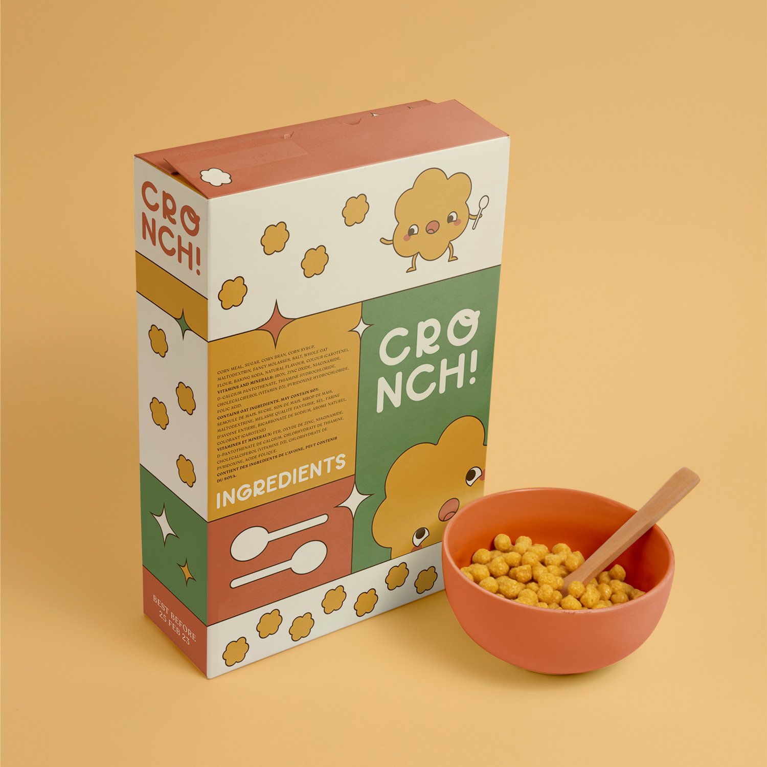
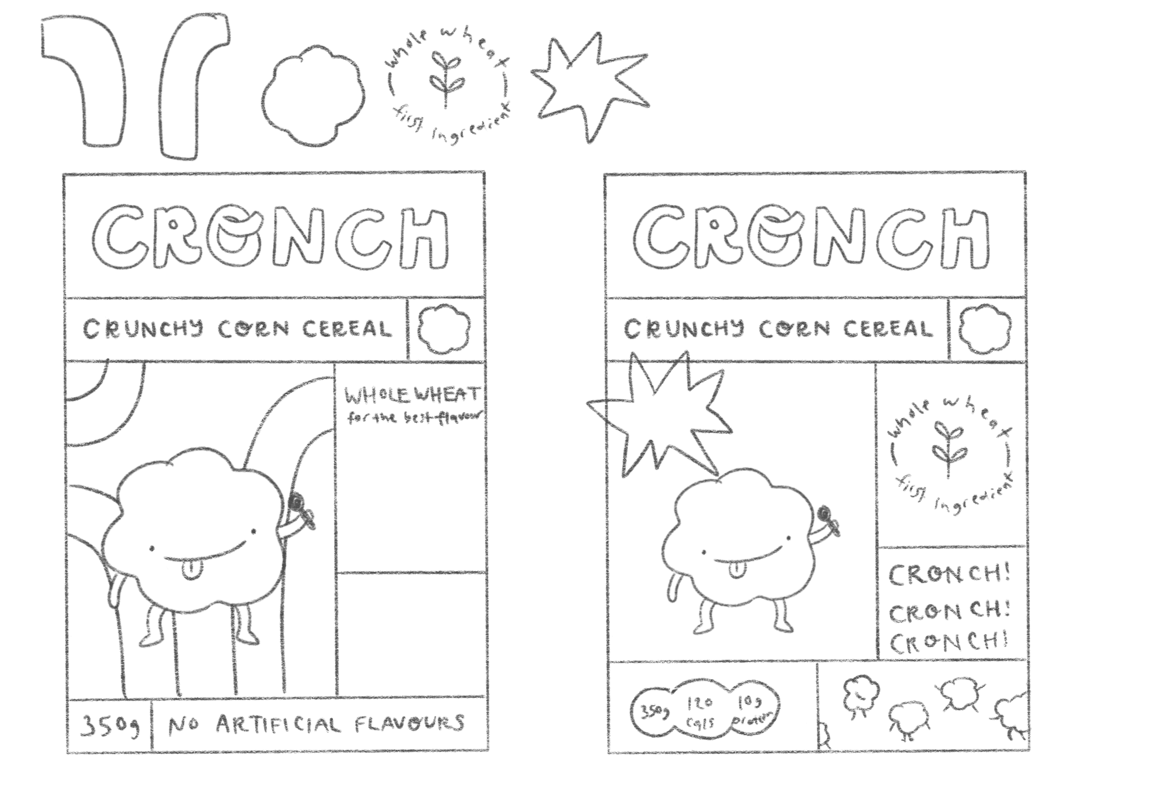
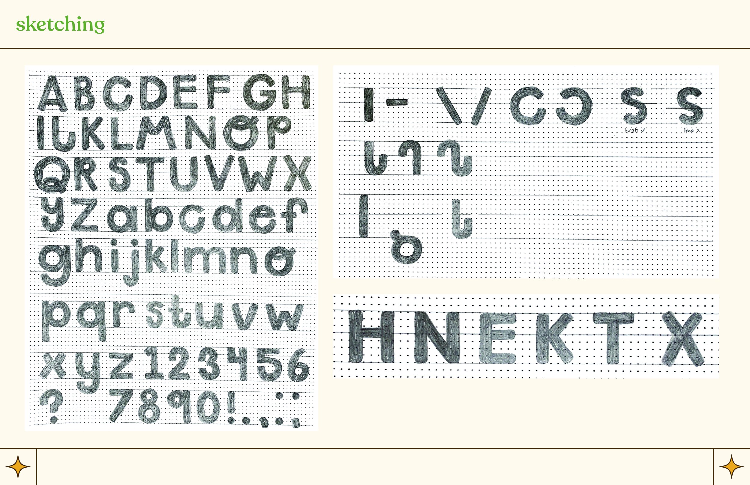
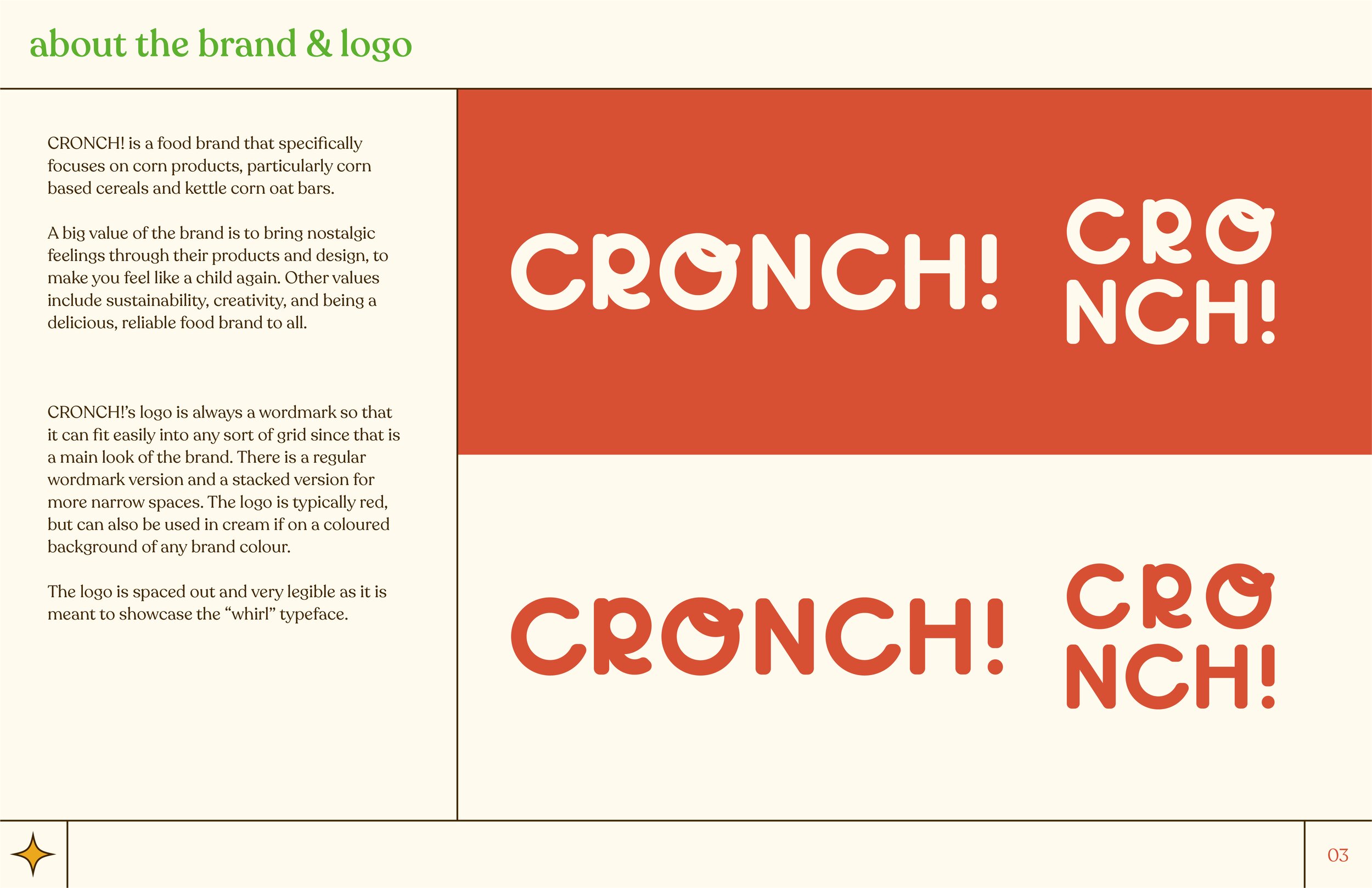
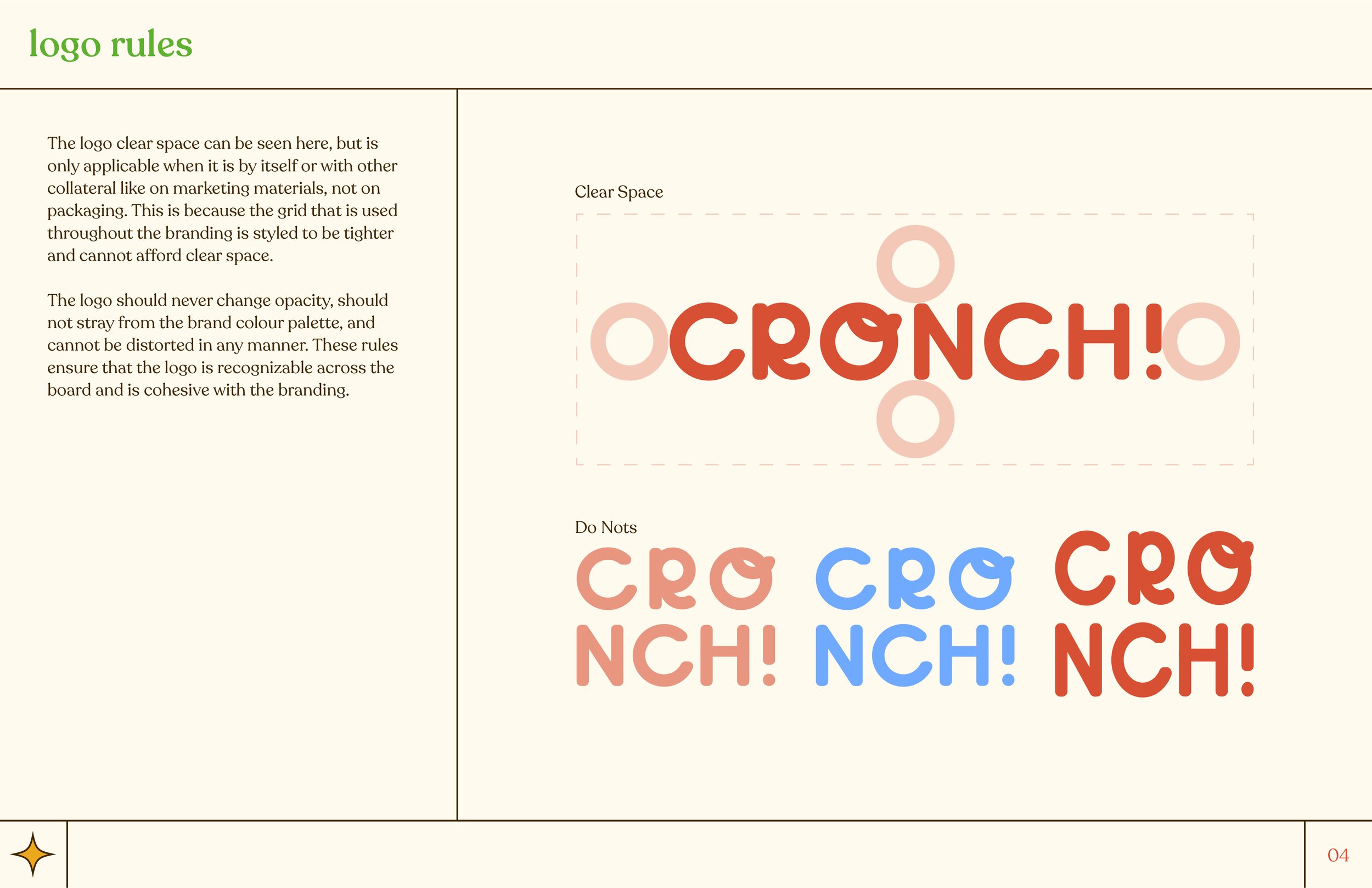
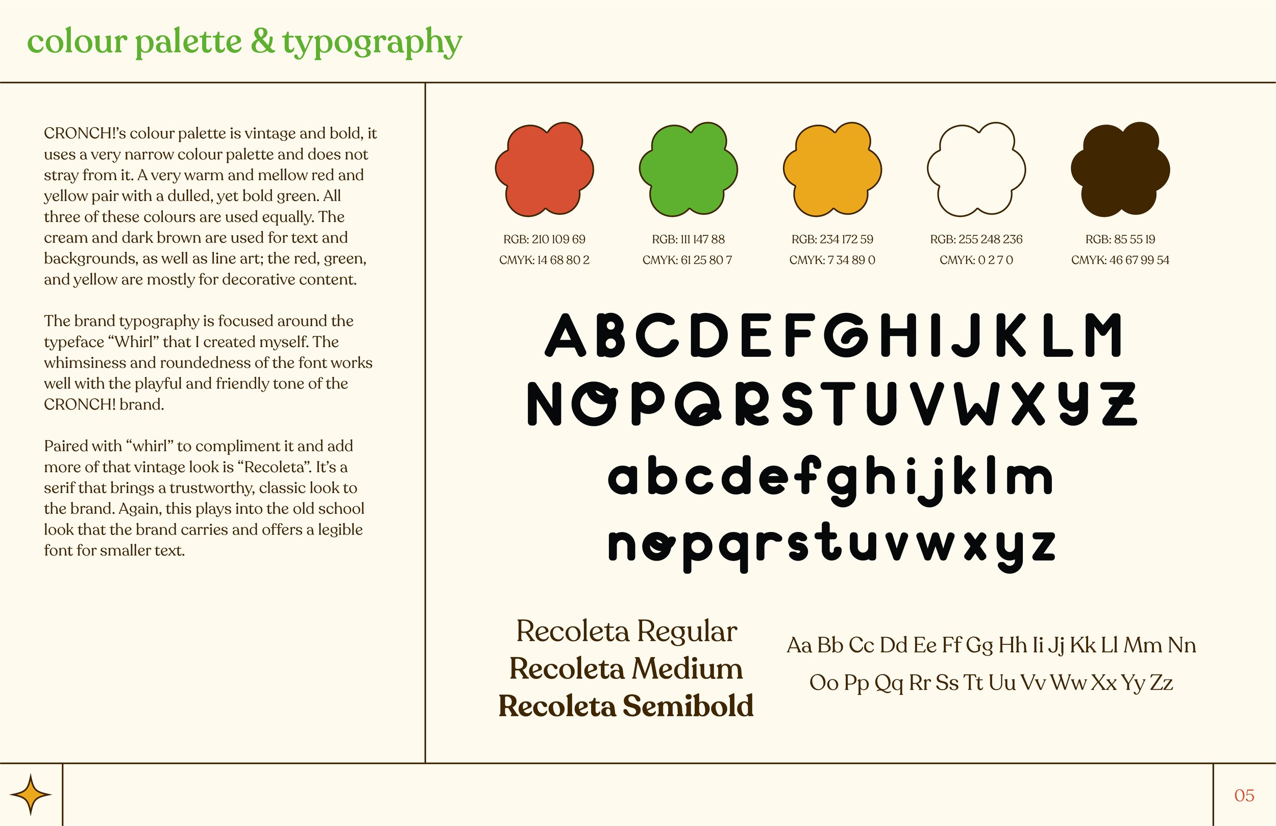
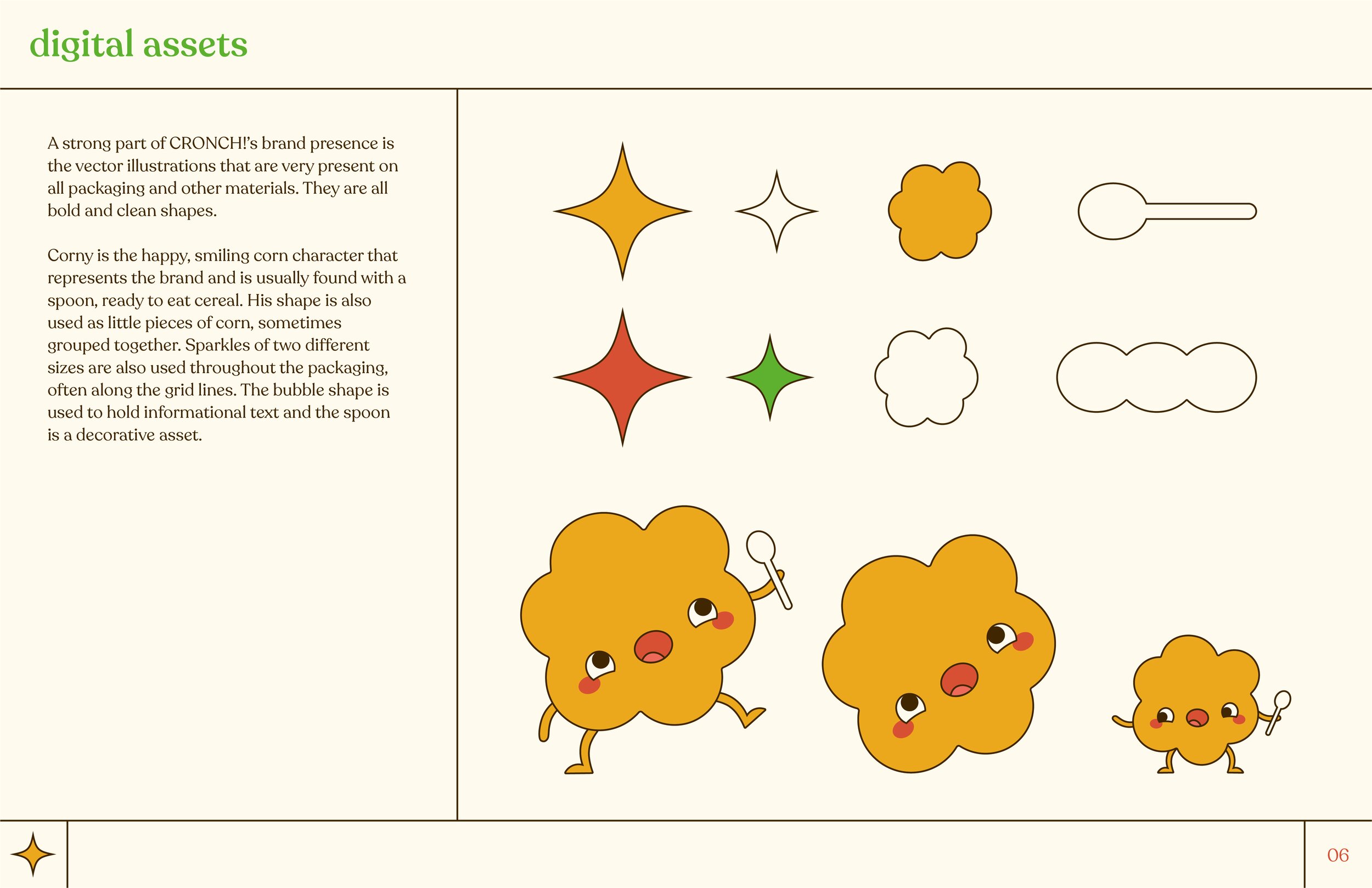
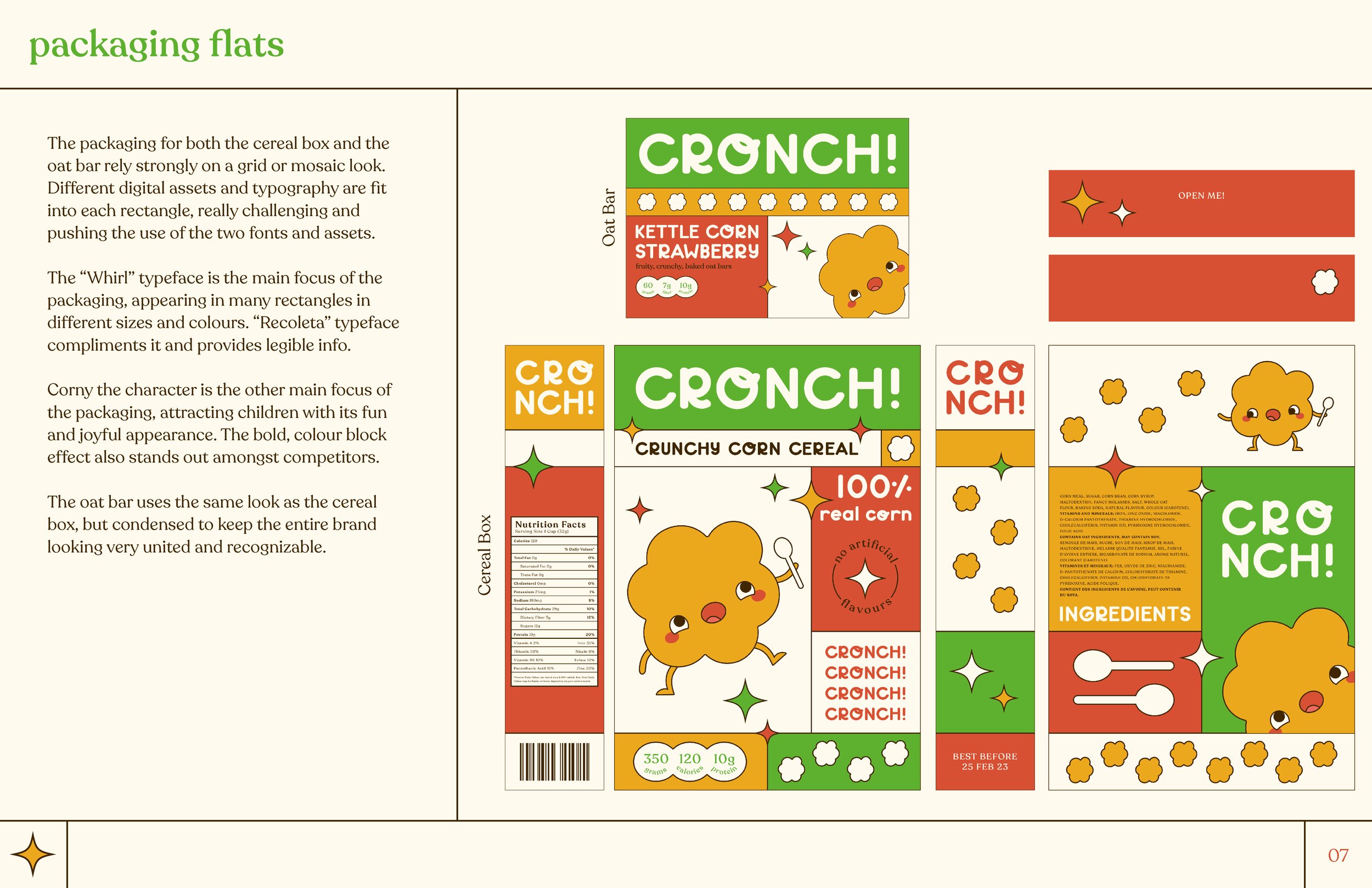
CRONCH! Branding, Packaging & Font Design
The goal of this project was to create my own typeface from scratch - considering all typography rules and what the purpose of the typeface would be. I created my typeface “Whirl” with intent to make it a friendly, whimsical, rounded edge font that could be used as a display font - great for big usage like on packaging. I accompanied the initial project by using my typeface to create an entire brand around it and two packaging pieces for it: CRONCH! cereal and kettle corn oat bars.
I wanted the brand to be nostalgic, bold, and inviting with a unique style that stands out among the rest on shelves. Hence, the colour blocking/mosaic style that would challenge me to really push the limits of my font and the graphic elements I had designed as part of the brand.
Packaging Mockups:


Sketches & Brand Guidelines:
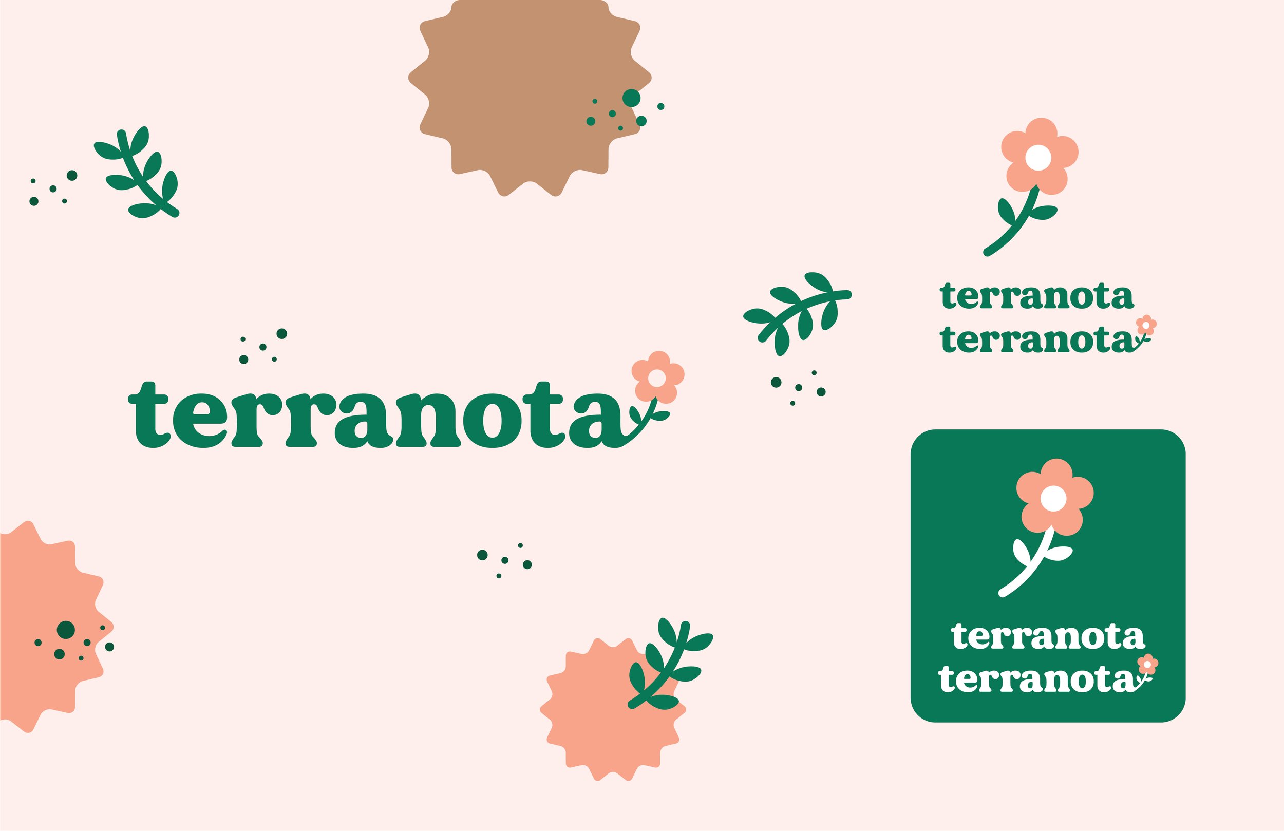
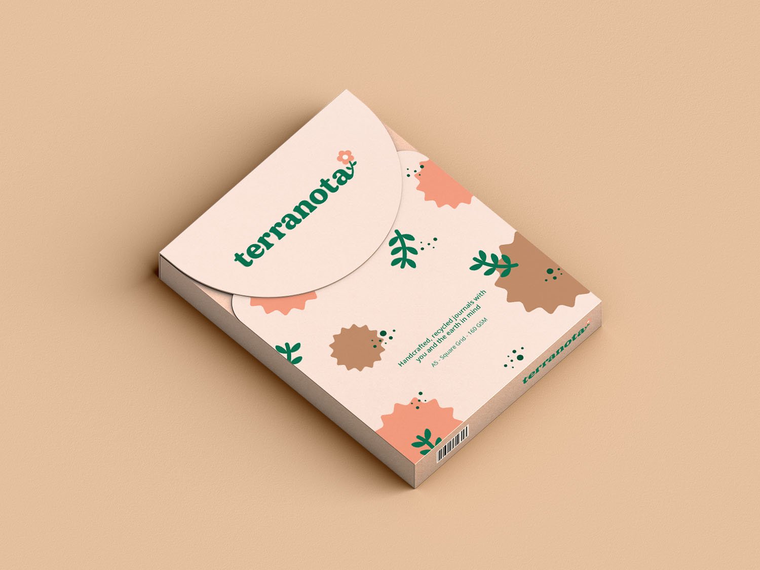
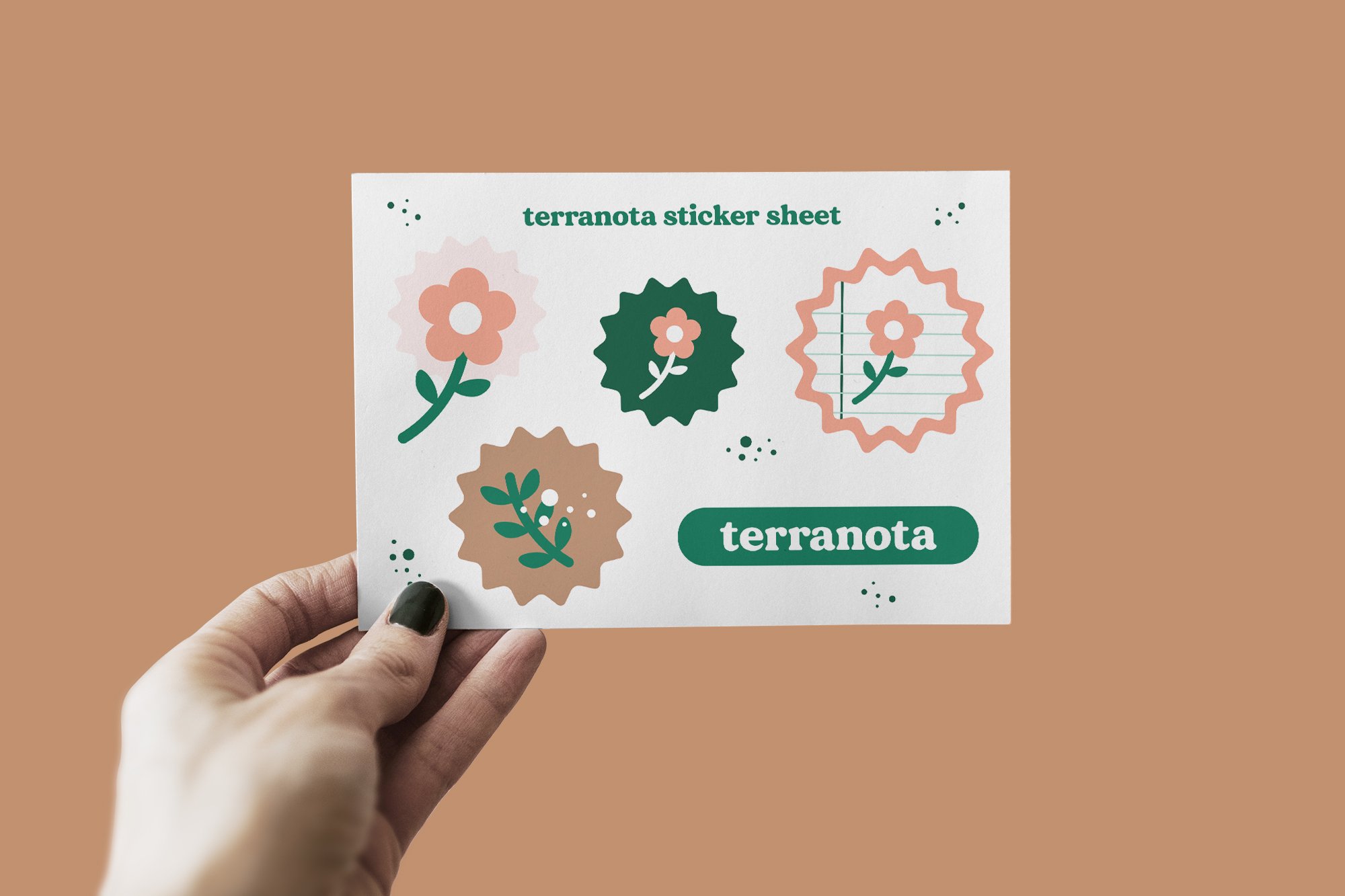
Terranota Stationery Brand
I created the branding, packaging, and several marketing materials for an imaginary journaling/stationery brand called “Terranota”.
This includes the full brand guidelines, a packaging box for the journals, and a sticker sheet. The marketing materials include a poster, pop-up booth, and both a Facebook and Instagram page, as well as stationery and a mockup of what the website might look like.
The goal for Terranota was to create a warm, transparent, and sustainable stationery brand focused on creating a welcoming community for paper lovers. The brand is bright, fun, and modern to attract a younger customer base who are more eco-minded and could easily benefit from the mental health perks of journaling.

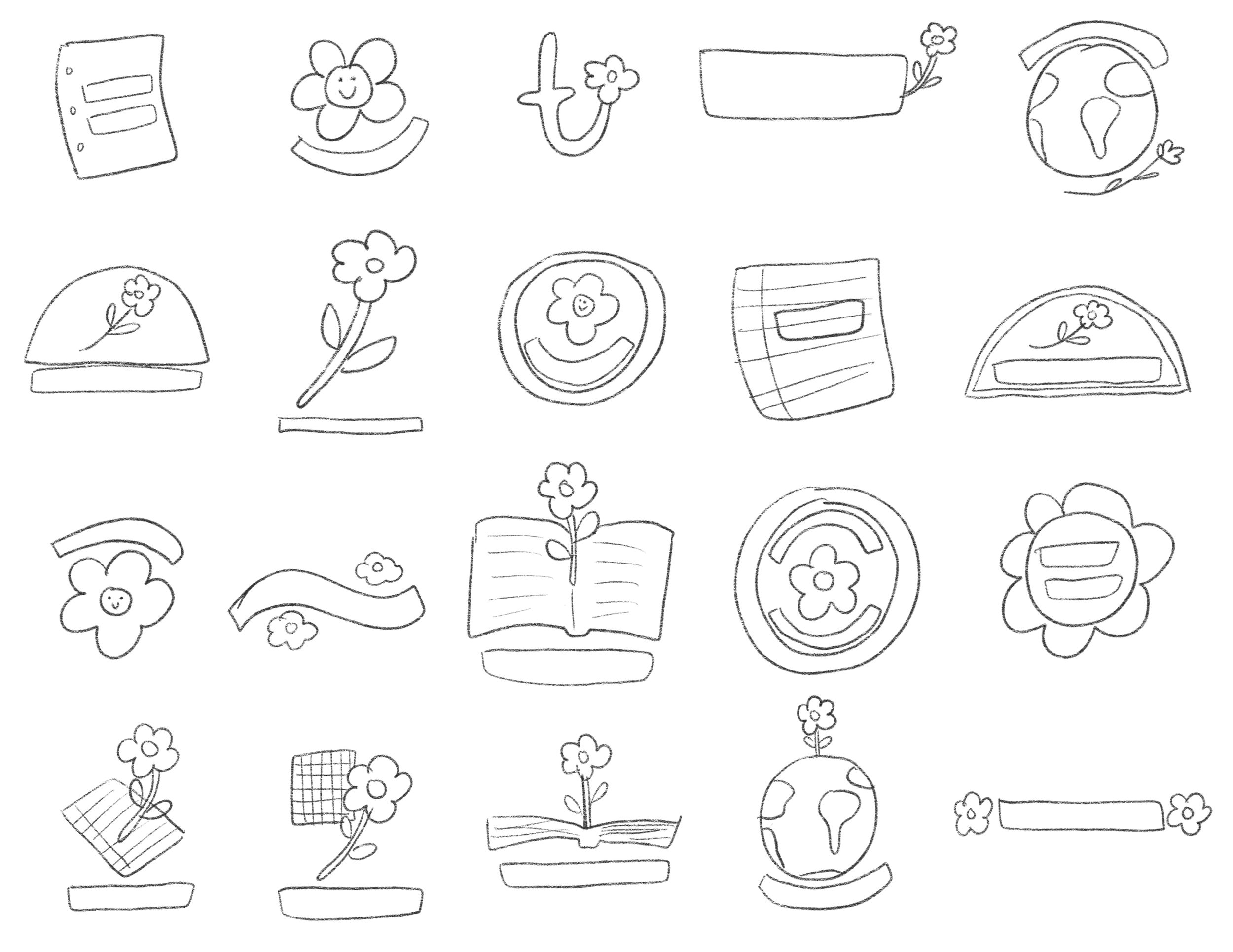
Sketches, Branding & Packaging:

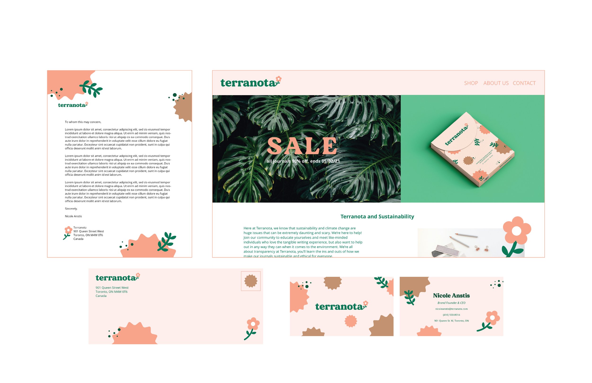
Promotional Pieces:


Campaign Purpose:
To target a younger audience who may use Terranota journals for mental health or study purposes, pop-up booths would be in community buildings on university/college campuses talking with real students. The posters would also be hung in these buildings and the web advertisement would be placed on study sites or bibliography creating sites.

Lull Magazine
Lull Magazine is a magazine that I wish I had for the last few years of starting my art career and for the long time ahead of me as a creative. My goal with this magazine was to bring all of my favourite colours and subjects together into one easily digestible publication that is helpful and educational, but also relatable - something you come back to and find comforting. Lull is named after the “art block” that every creative faces, but it is not to be seen as a bad thing. I want this magazine to go against the current trend of toxic productivity and remind you that it’s okay to take breaks and not have everything handled all the time - you’ll see this topic in the features.
Design wise, this is the autumn volume of a seasonal magazine. This means lots of warm colours like oranges and reds, as well as yellow toned greens. The typography is meant to feel friendly, but modern and trendy and the graphics as well. I wanted everything to feel very artsy and comfortable, but still clean.

Feature Article Opening Spread

Feature Article Spread

Editor’s Letter & Field Trip Department: this department encourages creatives to get out of the house and get inspiration from something new!

Table of Contents

Mother Nature Department - teaches the reader about a new part of nature each issue, mushrooms for the autumnal issue!

What’s On Our Desk - a department showing art favourites from the writers each issue.
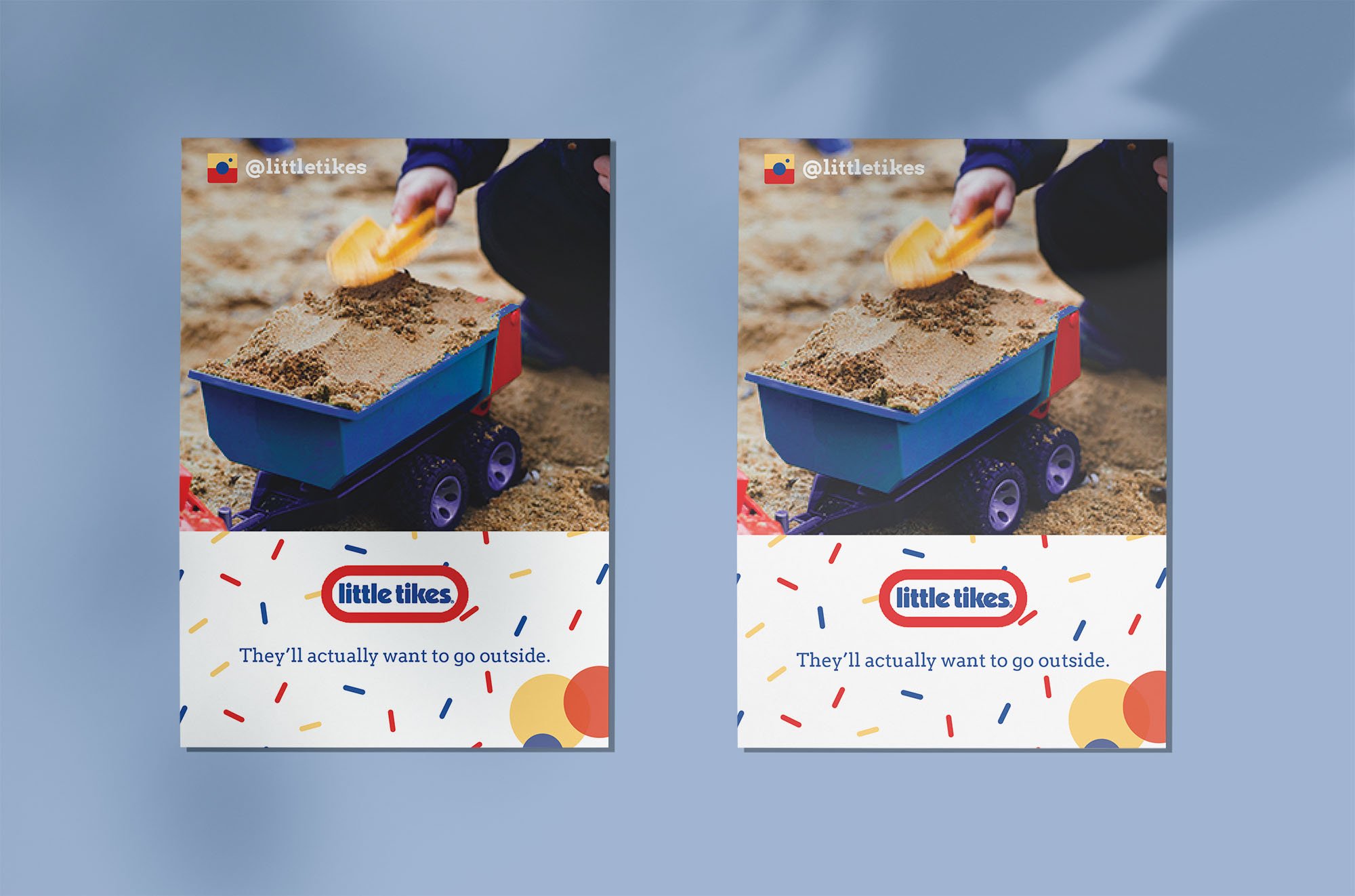
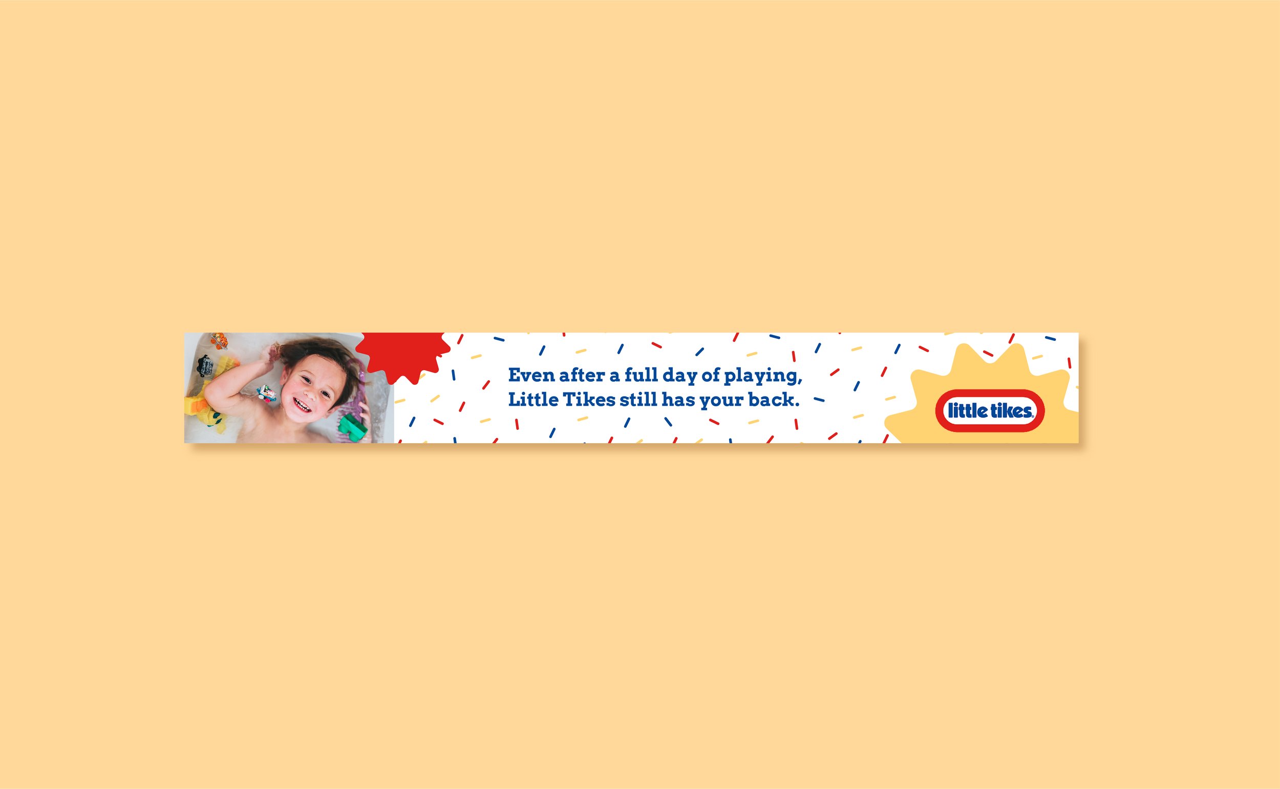
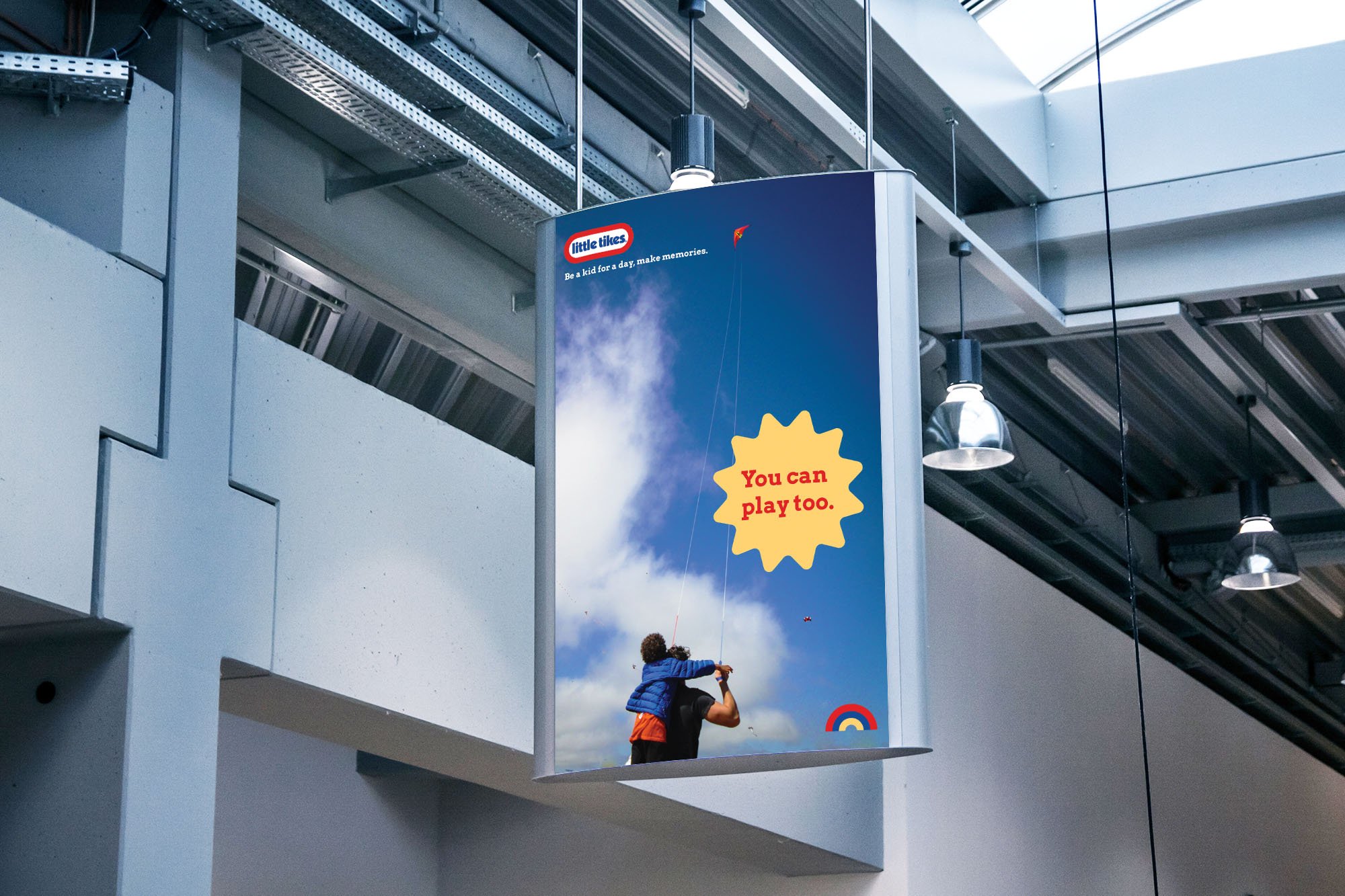
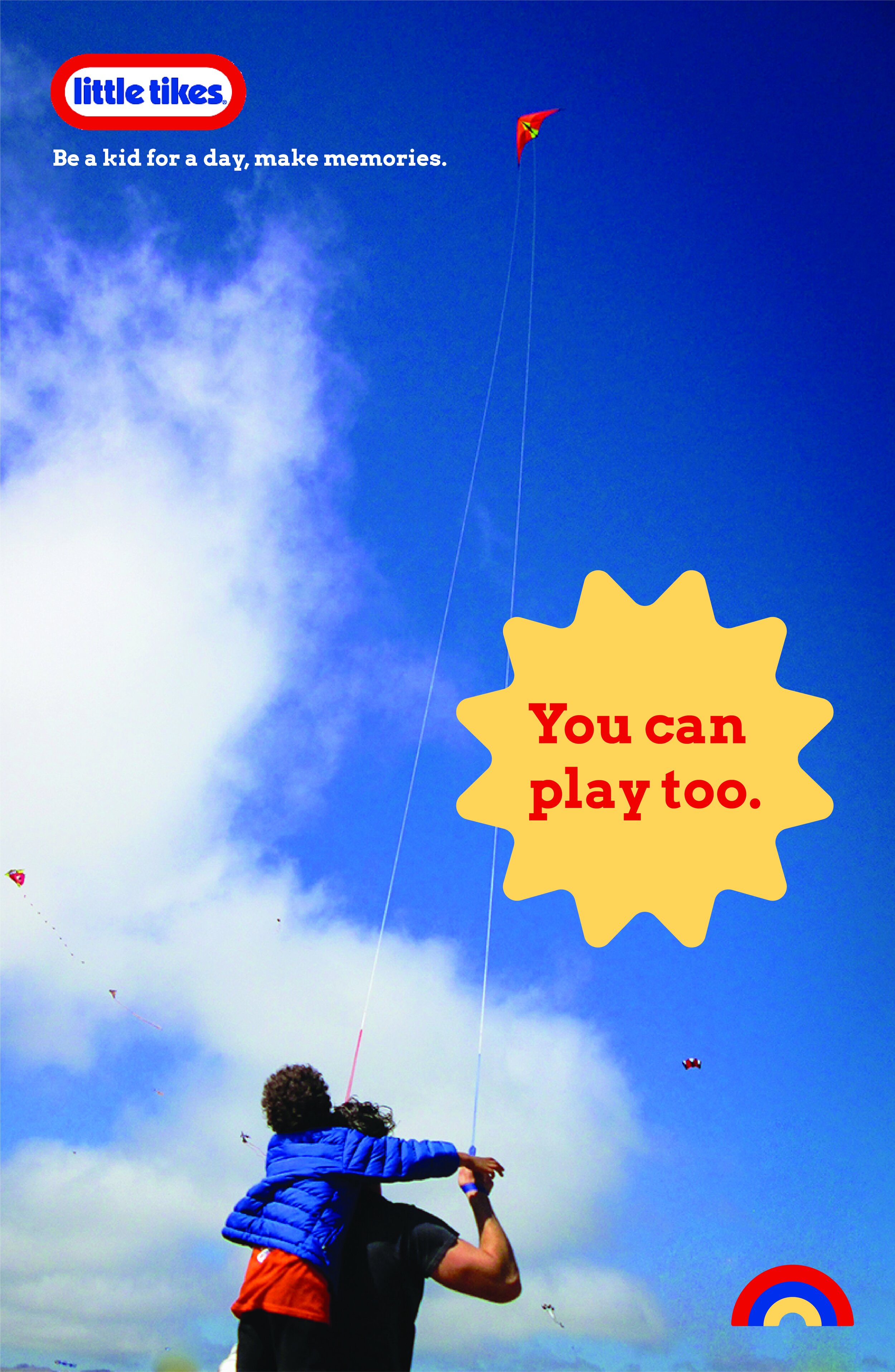
Little Tikes Re-brand & Promo Materials
For this project, I re-branded Little Tikes while keeping the general look of the brand, including the logo. The goal was to re-vamp what they already have and create some promotional materials to show off the new branding. I created new digital assets, added fonts and photos, and created icons too. I chose to showcase the branding through a poster, a postcard flyer, and a web banner!

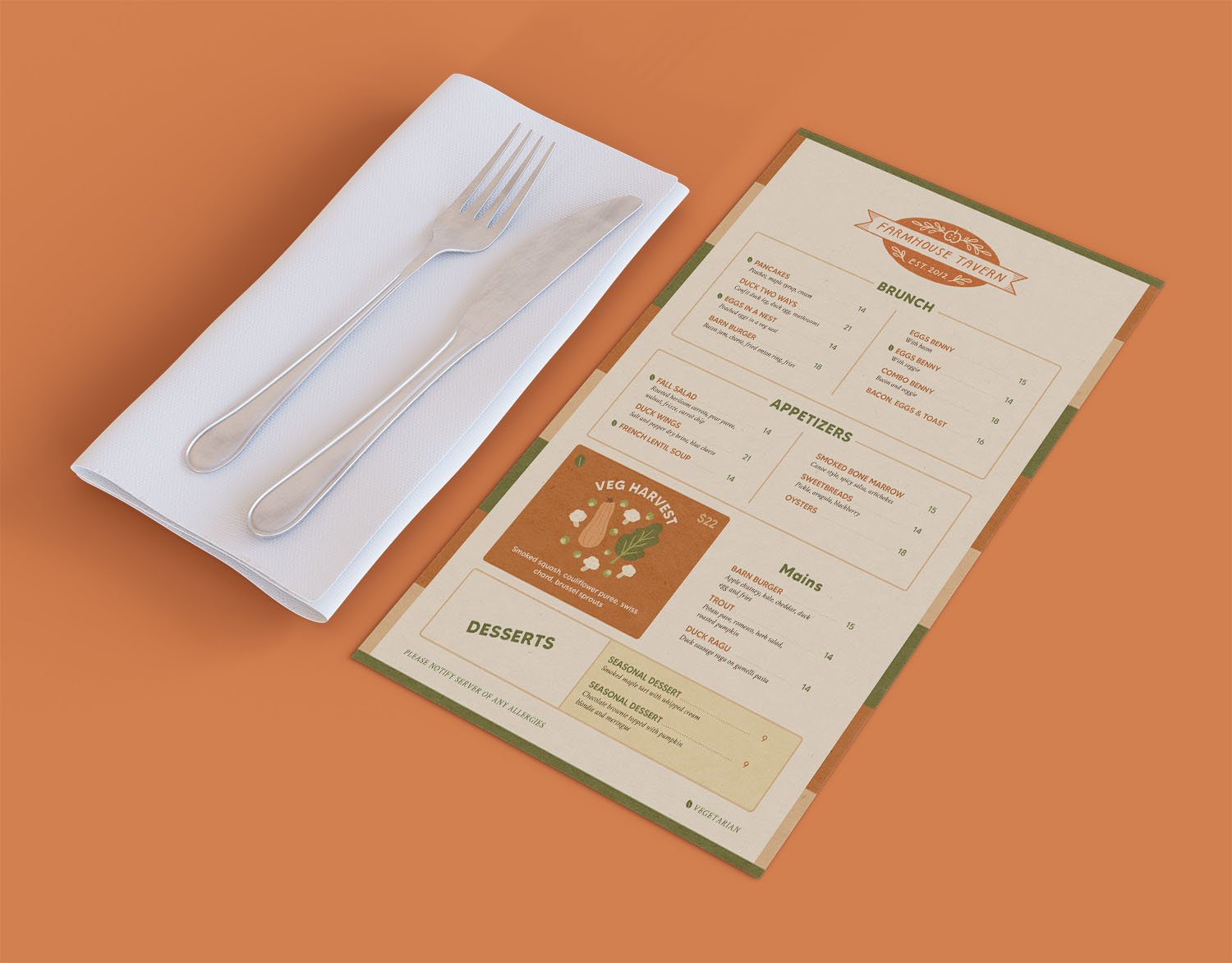
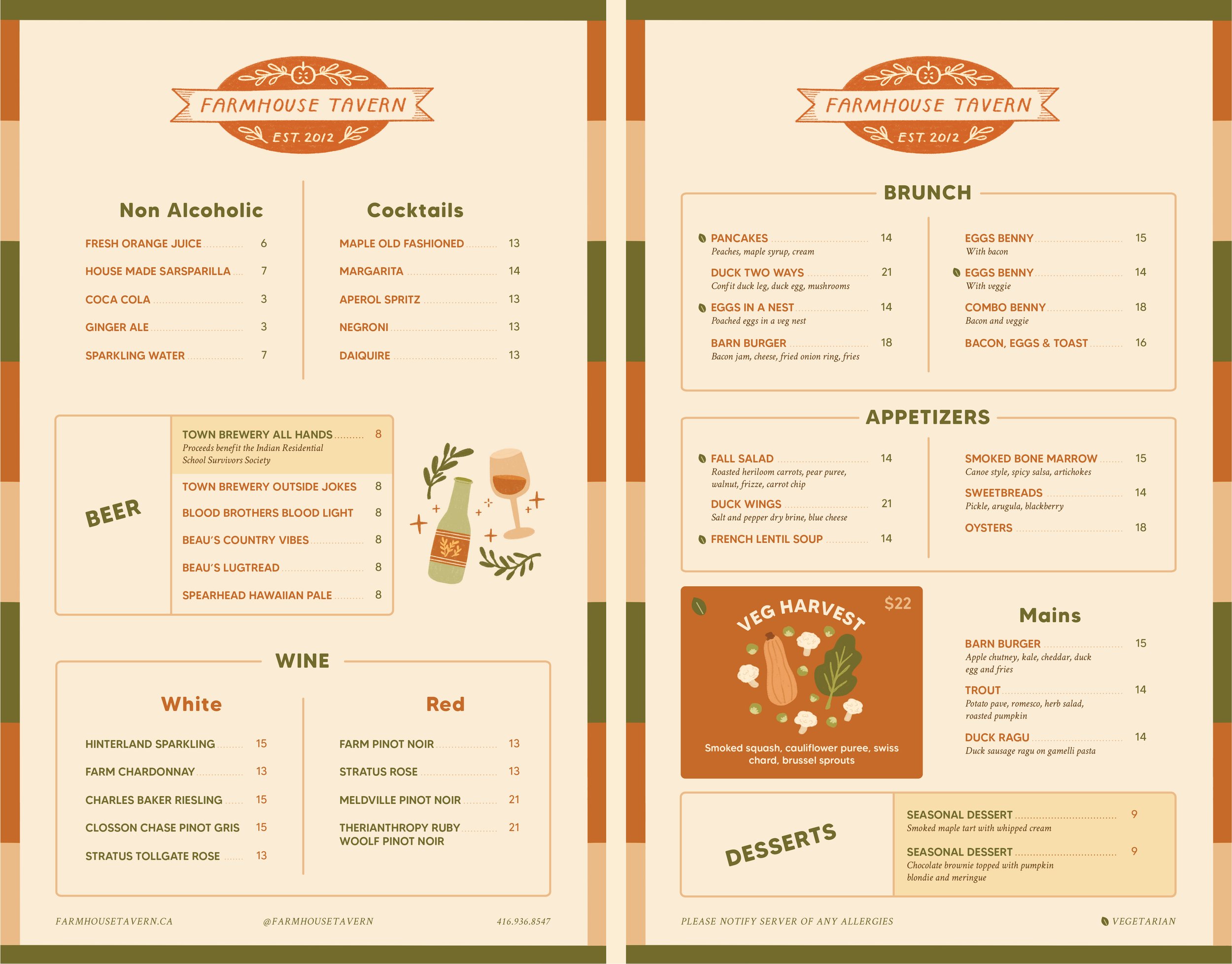
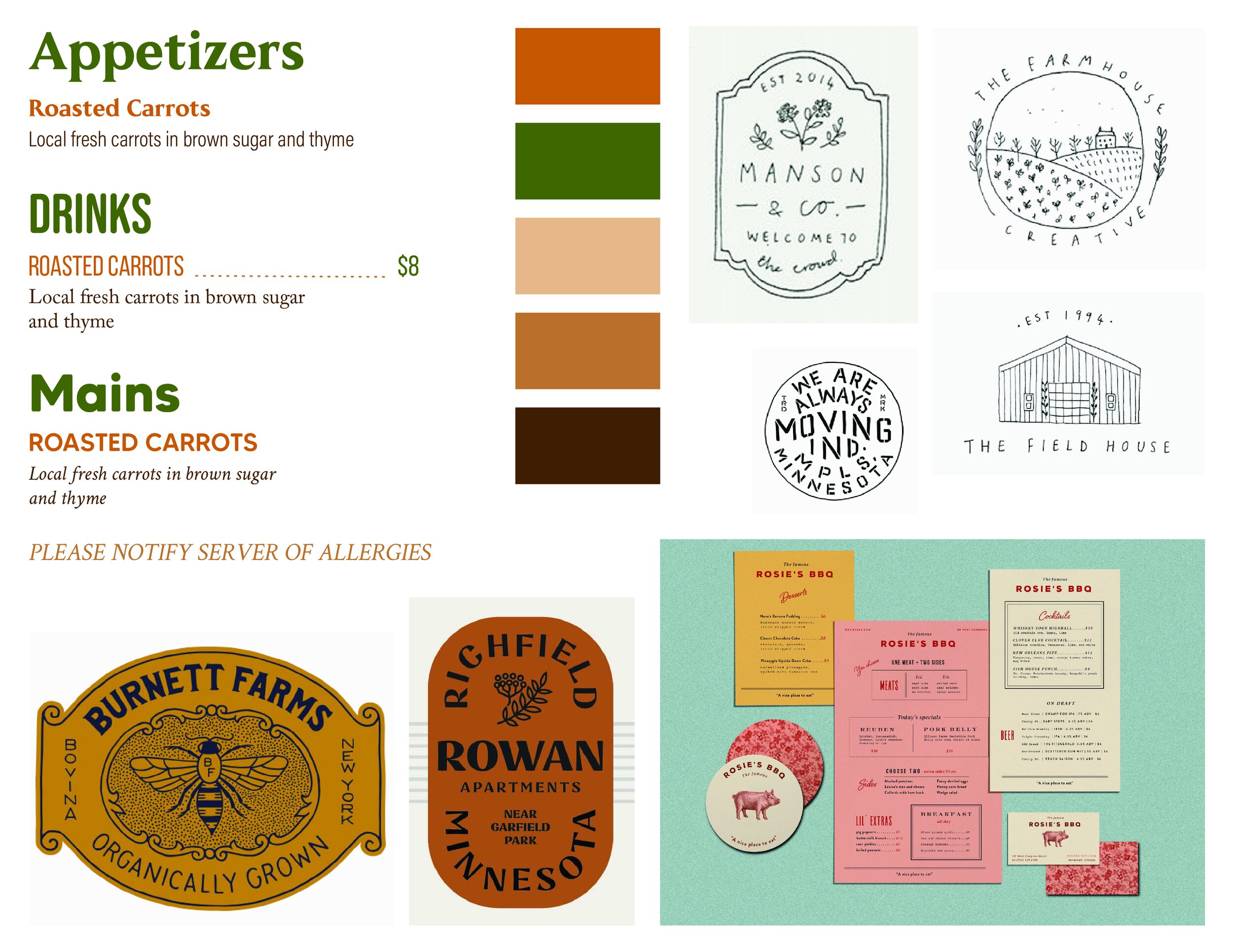
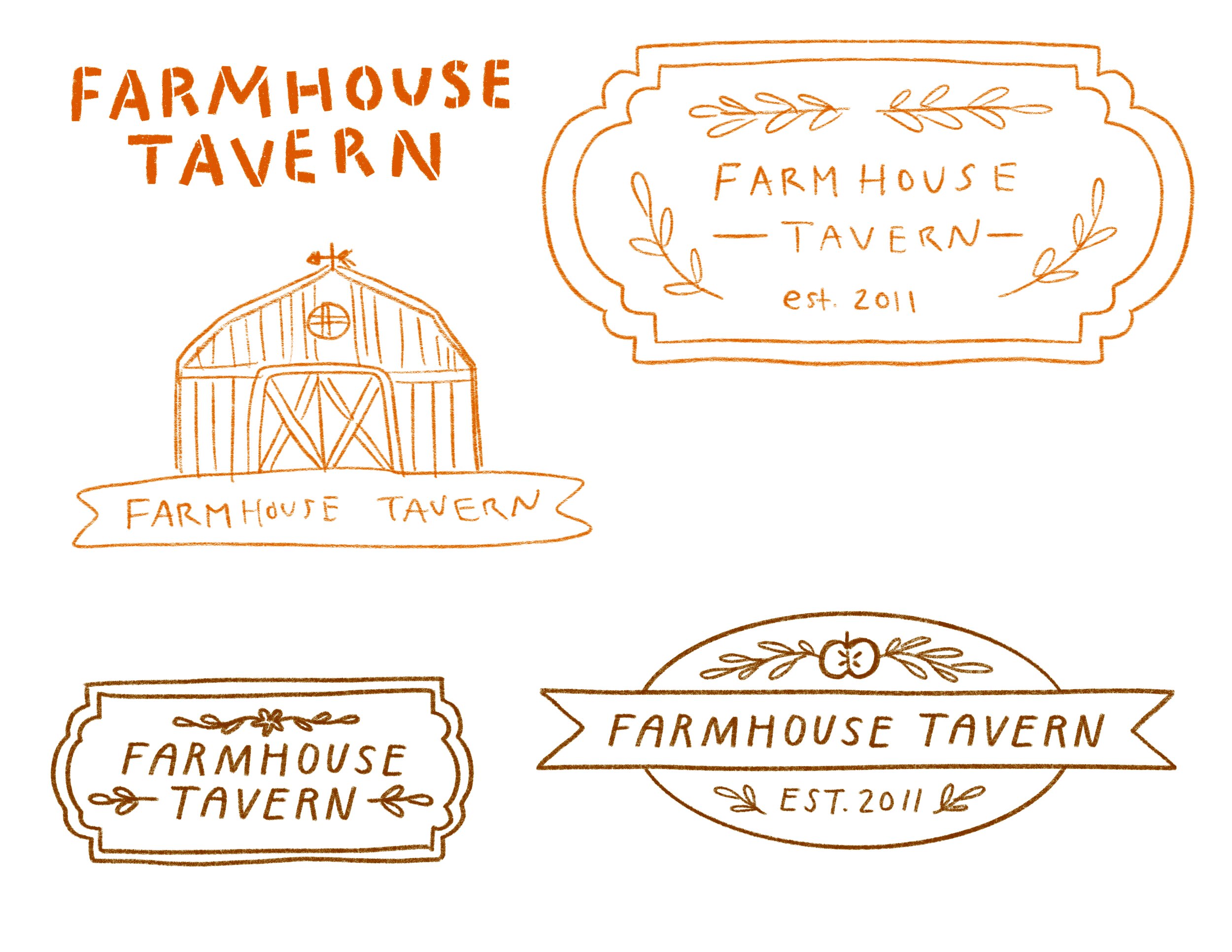
Farmhouse Tavern Menu
This recreated menu was inspired by the roots of the Toronto-based restaurant - natural, rustic, and from the farm. I chose natural, but bold colours and included illustrations to support the items that needed to be highlighted. My typography skills were put to the test to organize all of the menu items in an efficient way that looks attractive, while still being informative and easily legible.
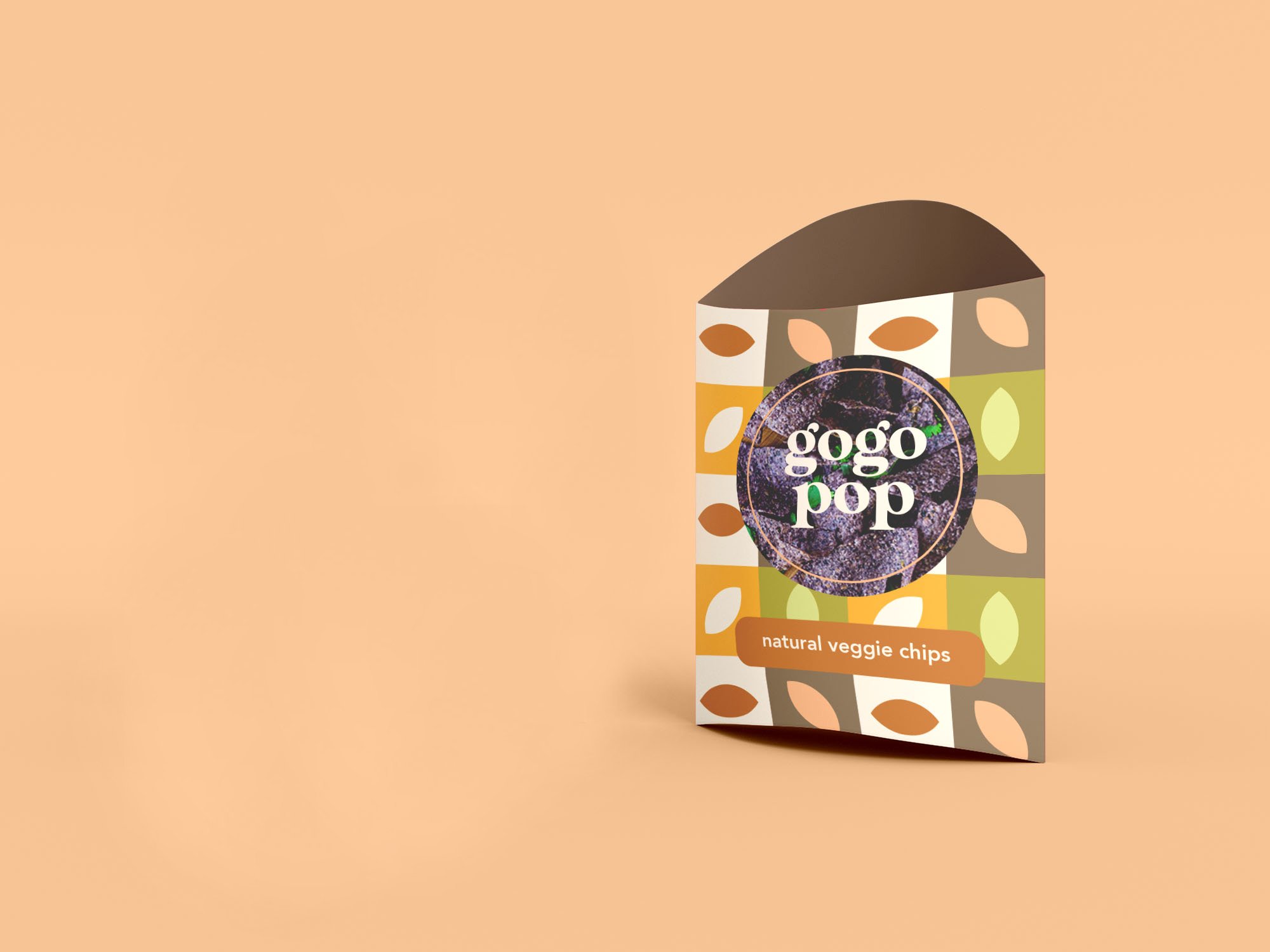
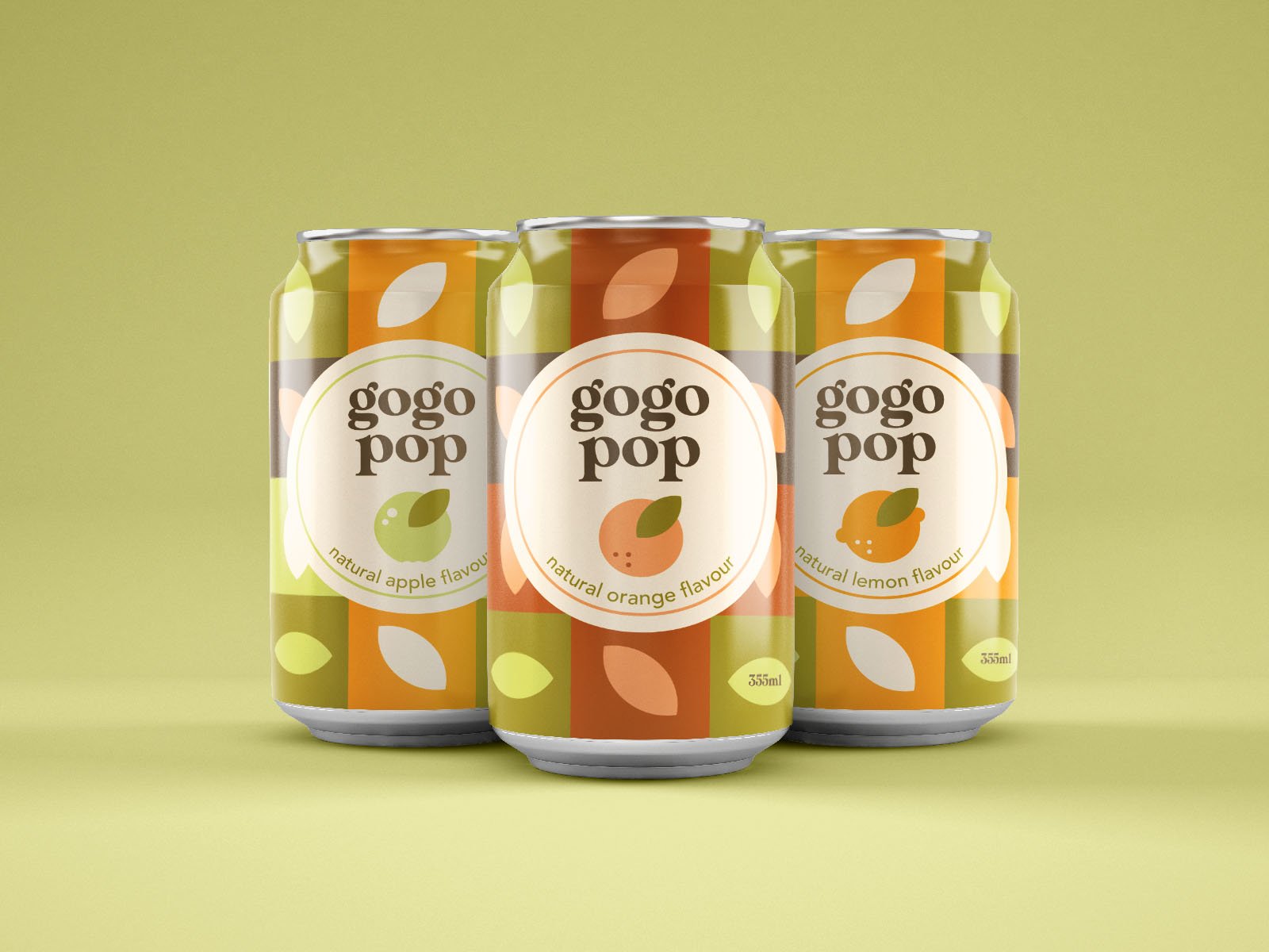
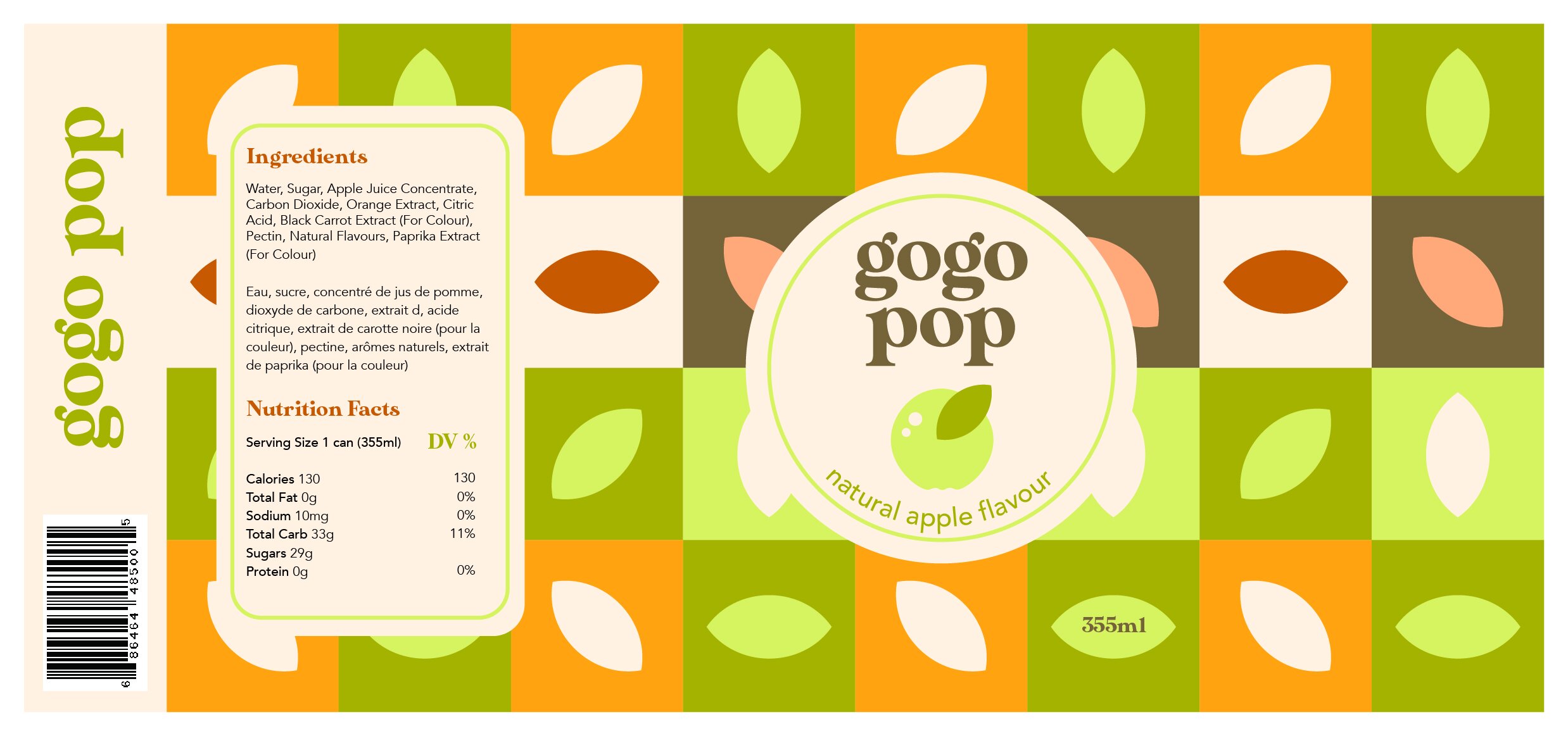
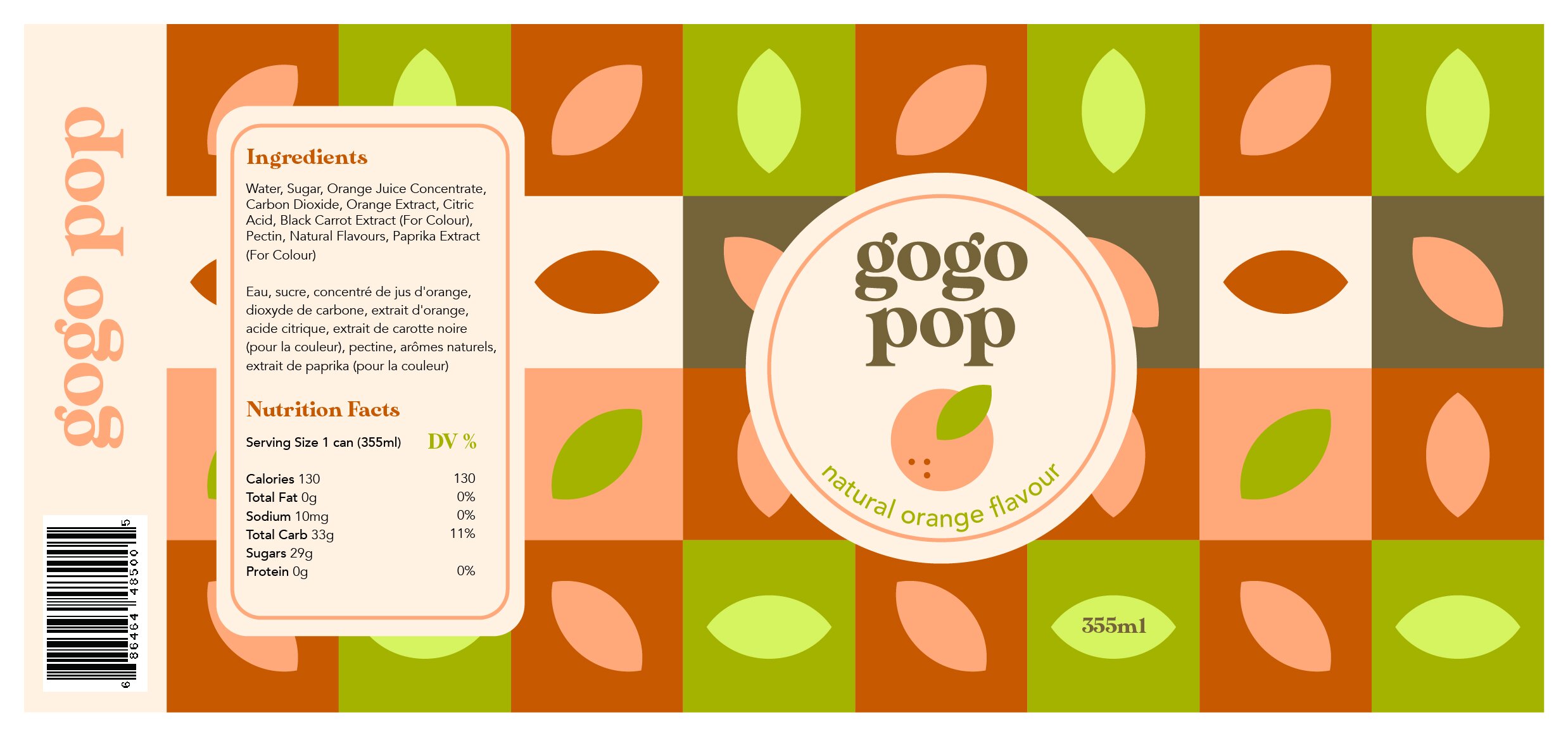
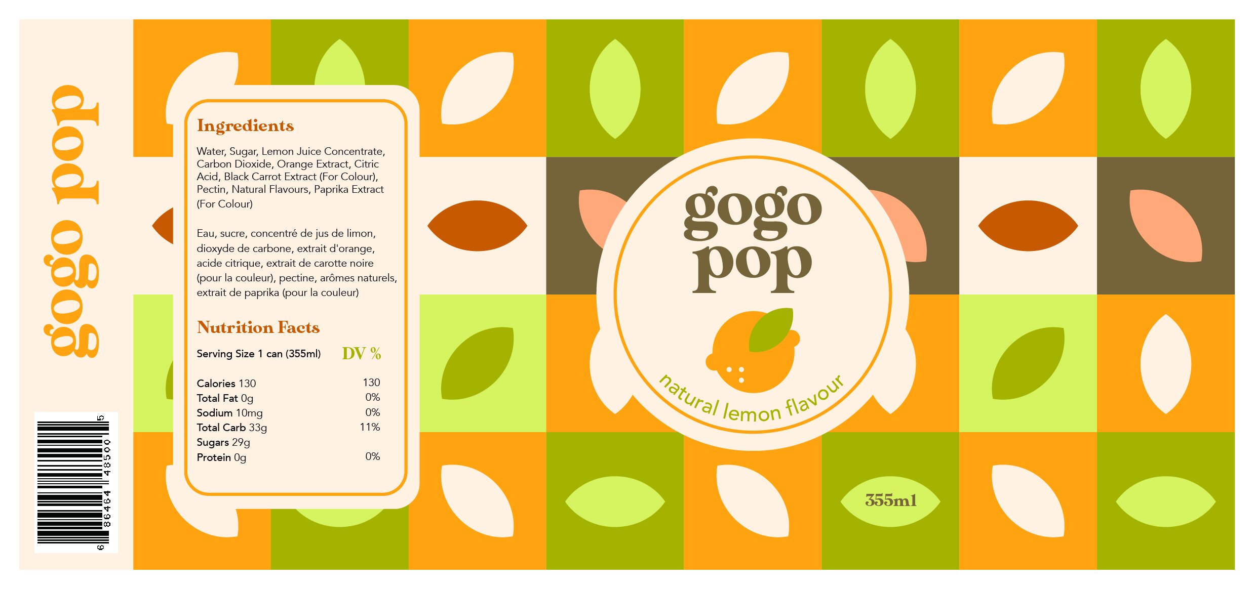
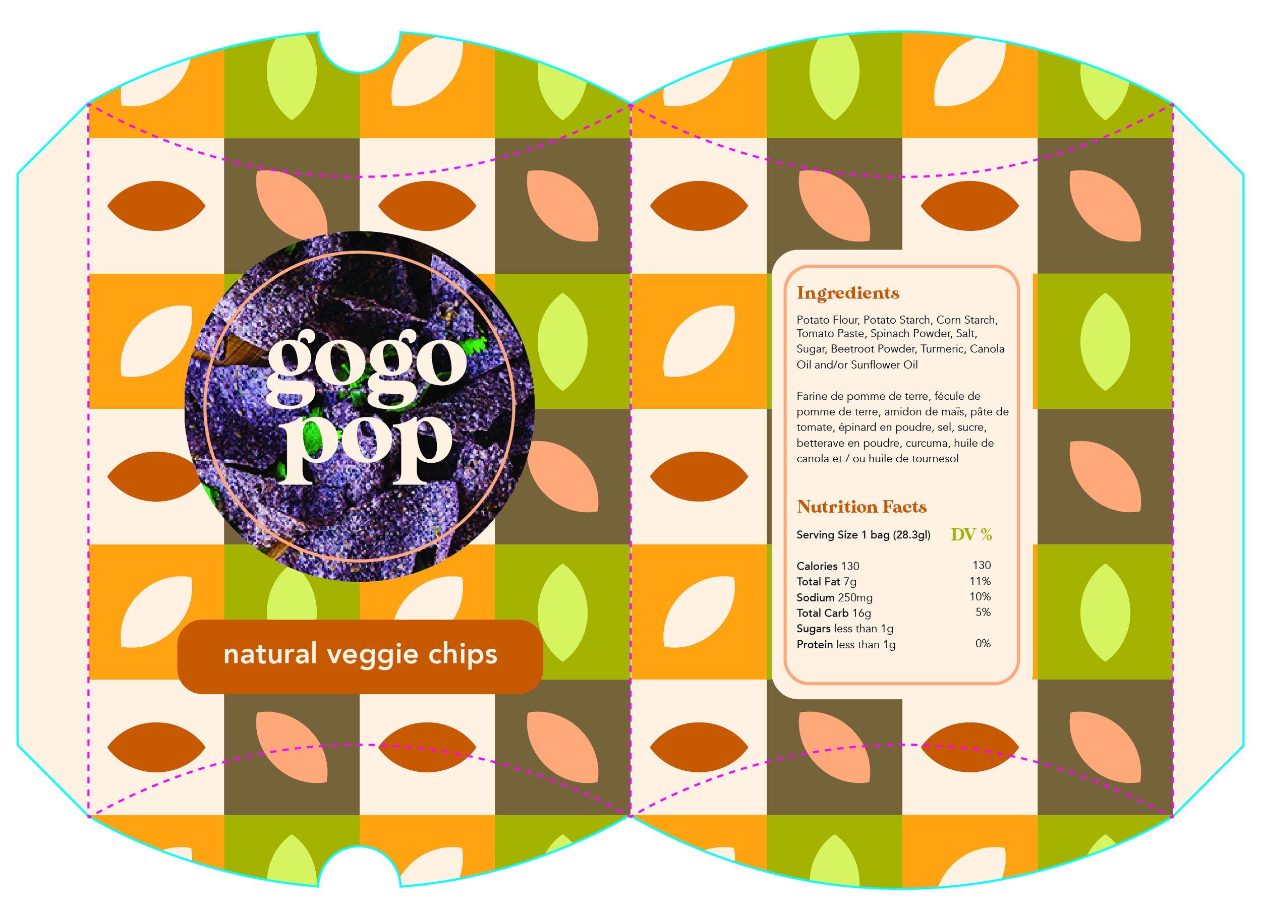
Gogo Pop Packaging
The purpose of this project was to design food packaging - both 2D and 3D. I used Adobe Illustrator to create my designs for a healthier soda and chips company: Gogo Pop. I went with natural, earthy colours to represent the healthier nature, but used them in a more fun, modern way to appeal to younger audiences still.


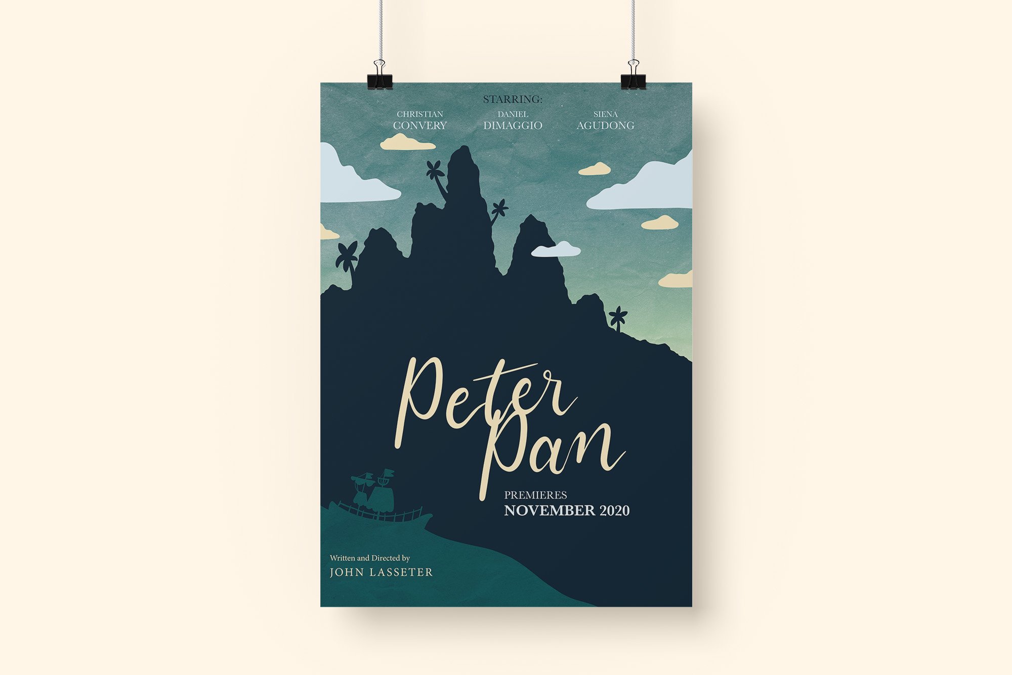
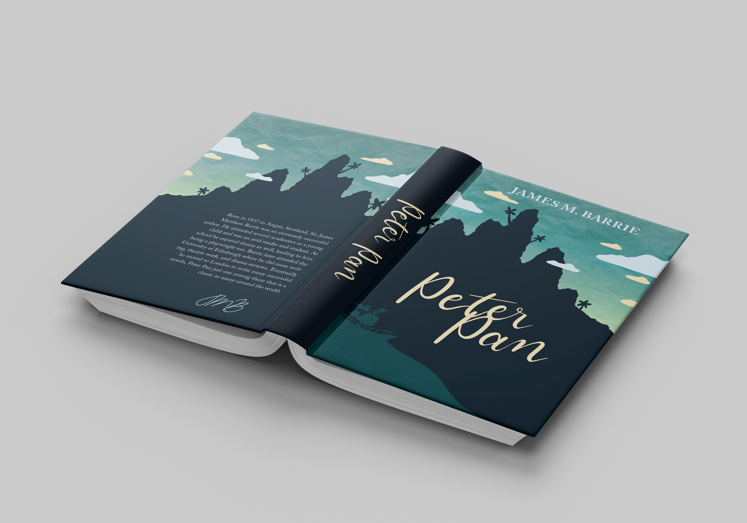
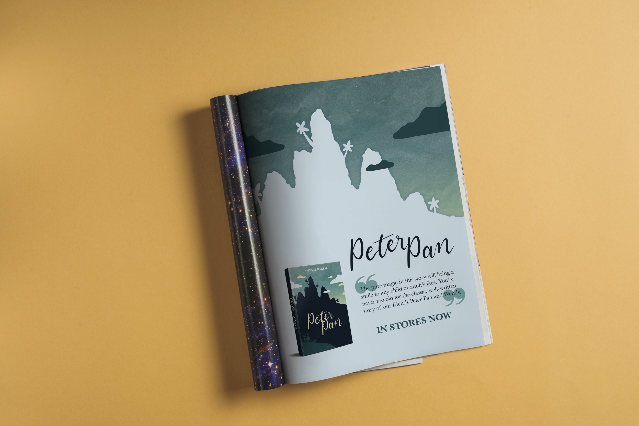
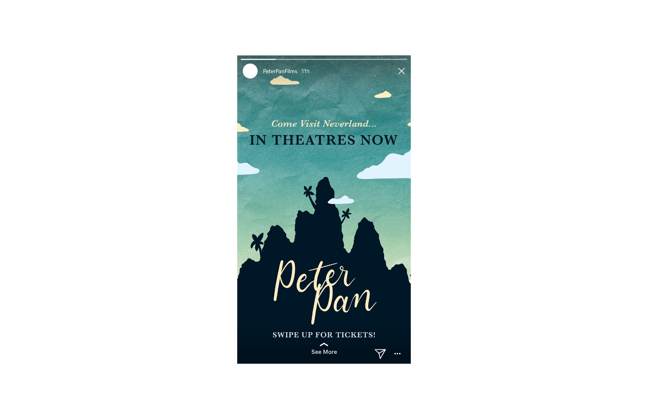
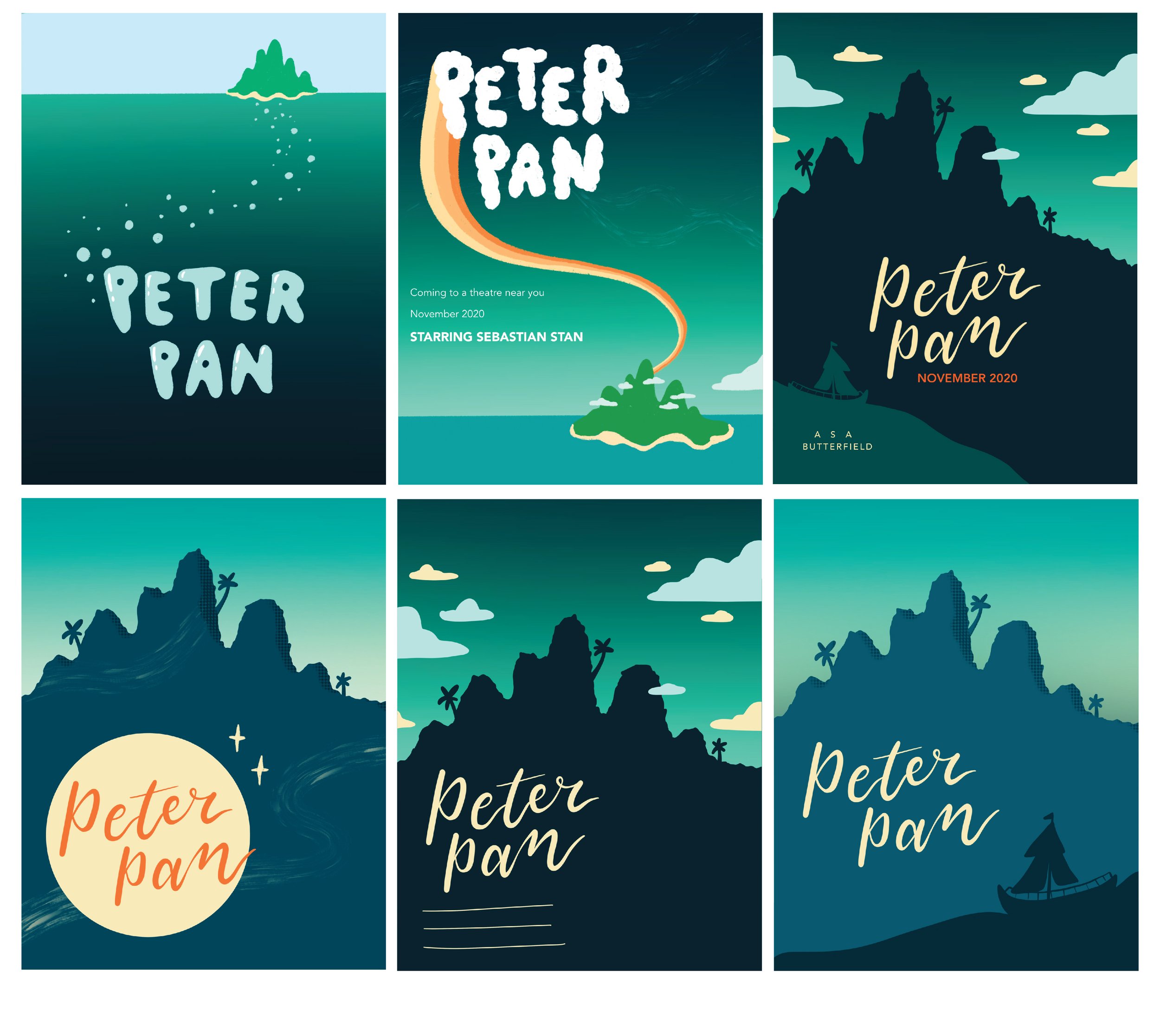
Peter Pan Book Cover, Movie Poster & Promotional Materials
The purpose of this project was to rec- reate a classic story book cover. I chose Peter Pan and wanted to give it a modern twist, while keeping it whimsical and illustrative in style.
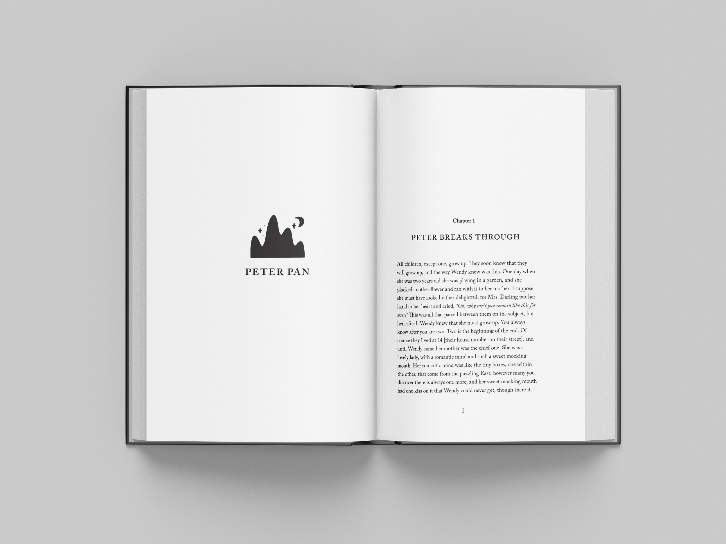
Although I started with the book cover, I also created a matching movie poster and marketing materials for the book and movie. This included a magazine advertisement and an Instagram story. I designed and type set several chapters of the interior of the book as well.
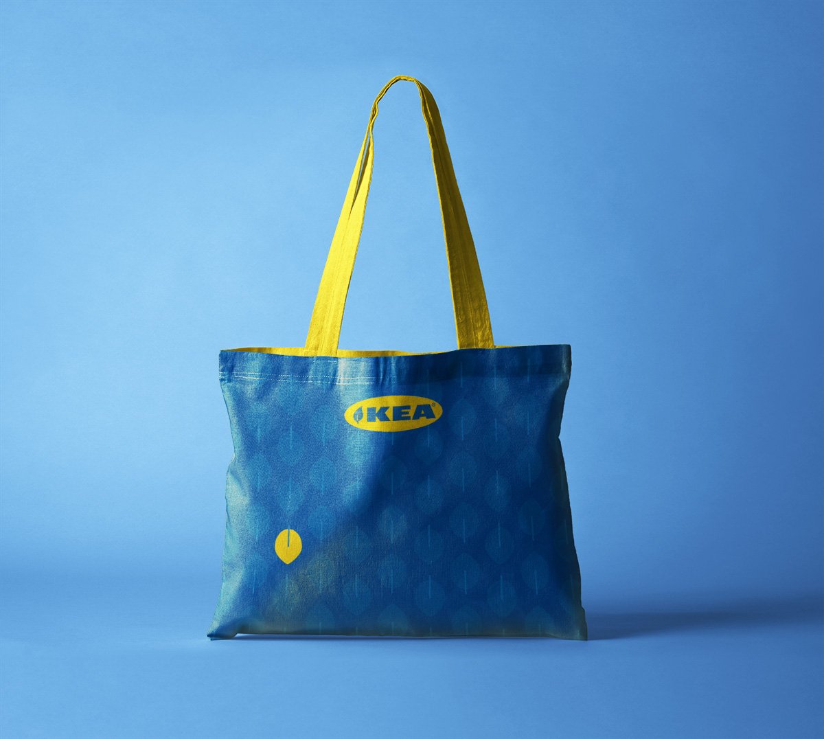
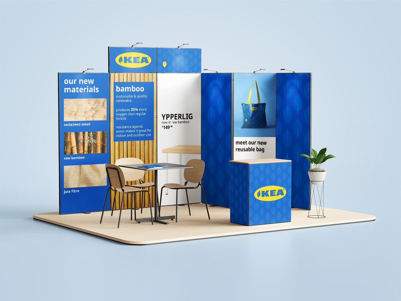
IKEA Sustainability Marketing & Design
The goal of this project was to determine the strengths and weaknesses of IKEA, as well as find an opportunity that they could take advantage of right now. My team focused on sustainability, a great way that IKEA could easily shine in the market that they are in. My idea was to recreate the iconic IKEA blue bag with sustainable materials like jute and change the look to reflect the campaign with a leaf pattern. I also created a booth that you would interact with in the store to learn about the sustainable materials that IKEA would offer for all of their most loved products.